Deprecated: str_contains(): Passing null to parameter #1 ($haystack) of type string is deprecated in /home/daymier/www/kath-n-ko/wp-includes/shortcodes.php on line 246

Deprecated: str_contains(): Passing null to parameter #1 ($haystack) of type string is deprecated in /home/daymier/www/kath-n-ko/wp-includes/shortcodes.php on line 246
Bougeoir en verre vintage, bougie et couronne de bougie – Kath-n-Ko

Bougeoir en verre vintage, bougie et couronne de bougie

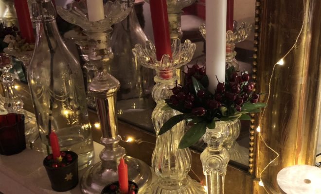
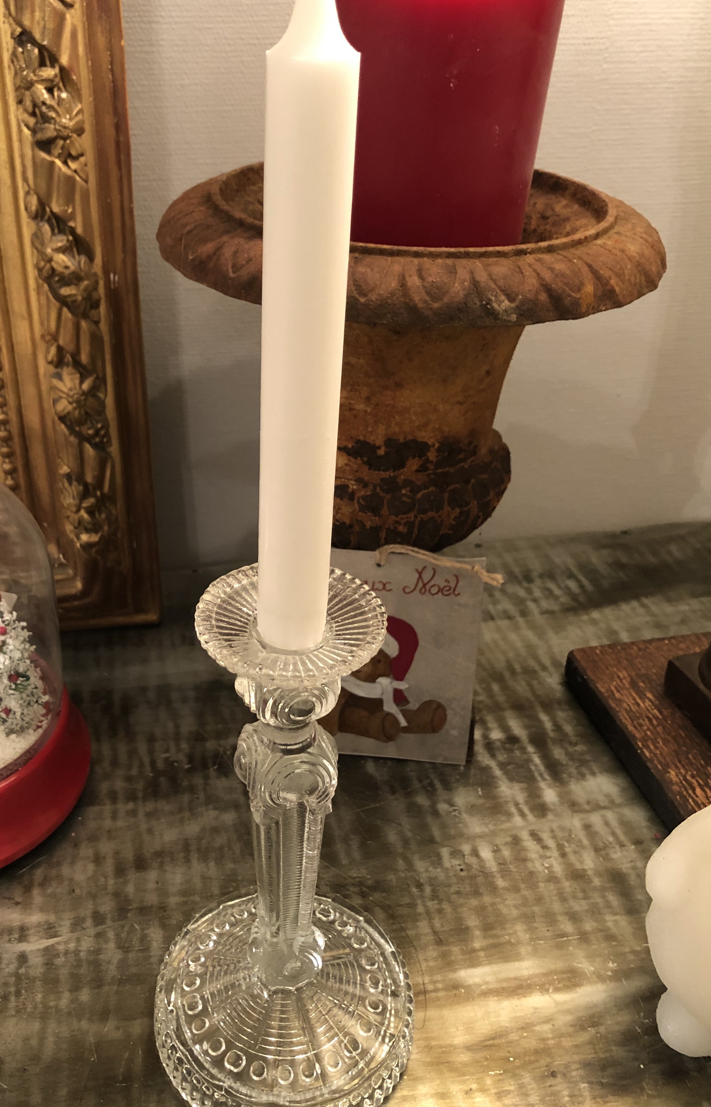
Ce bougeoir en verre tout simple sera de toutes les fêtes, il suffit de l’habiller un peu. En cette veille de Noël je lui ai ajouté une bougie rouge et une jolie couronne scandinave, bien sûr il peut se faire très discret juste avec une bougie blanche .

bougeoirenverreavendre


couronnedebougie


bougeoirseul

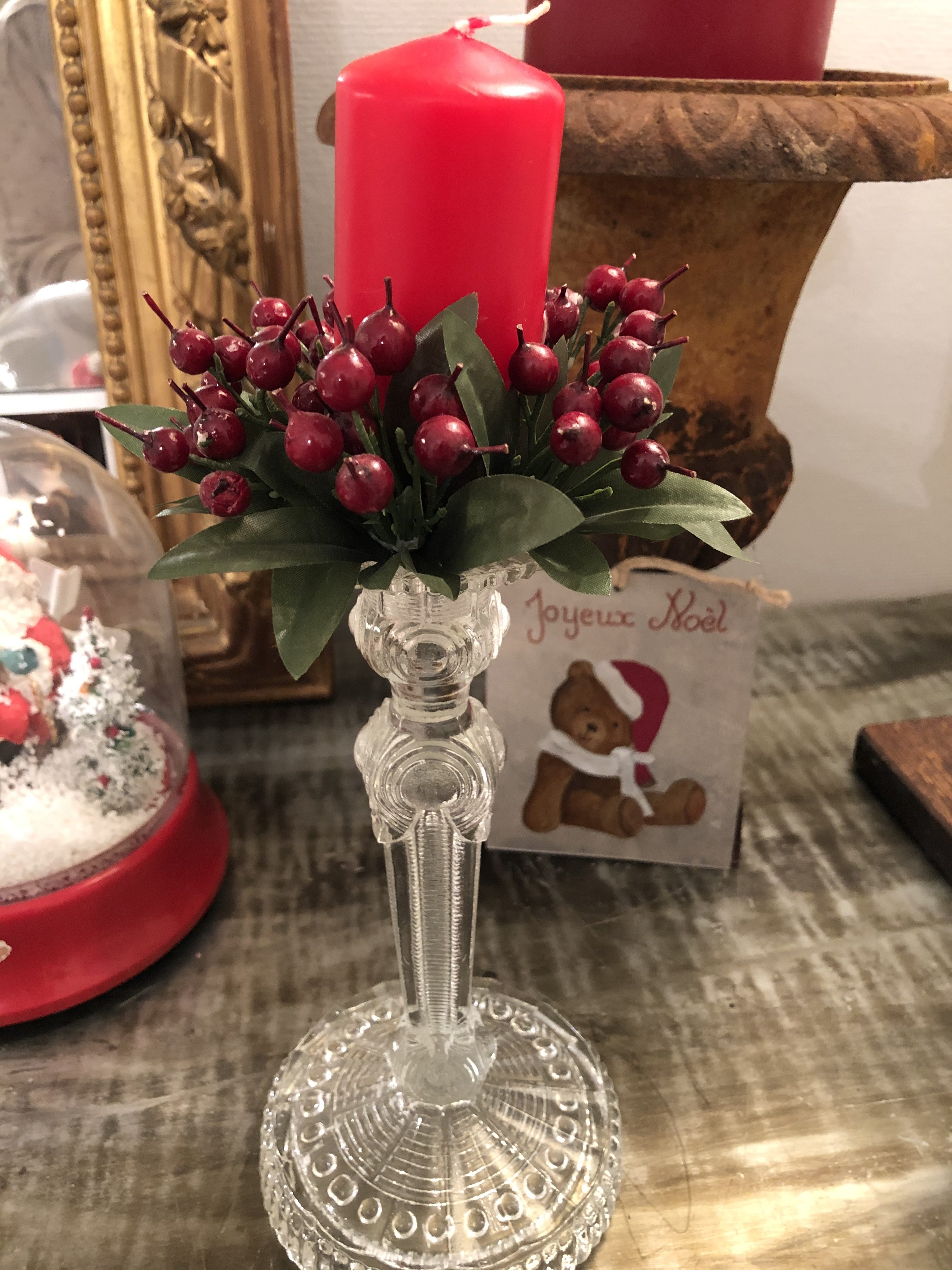
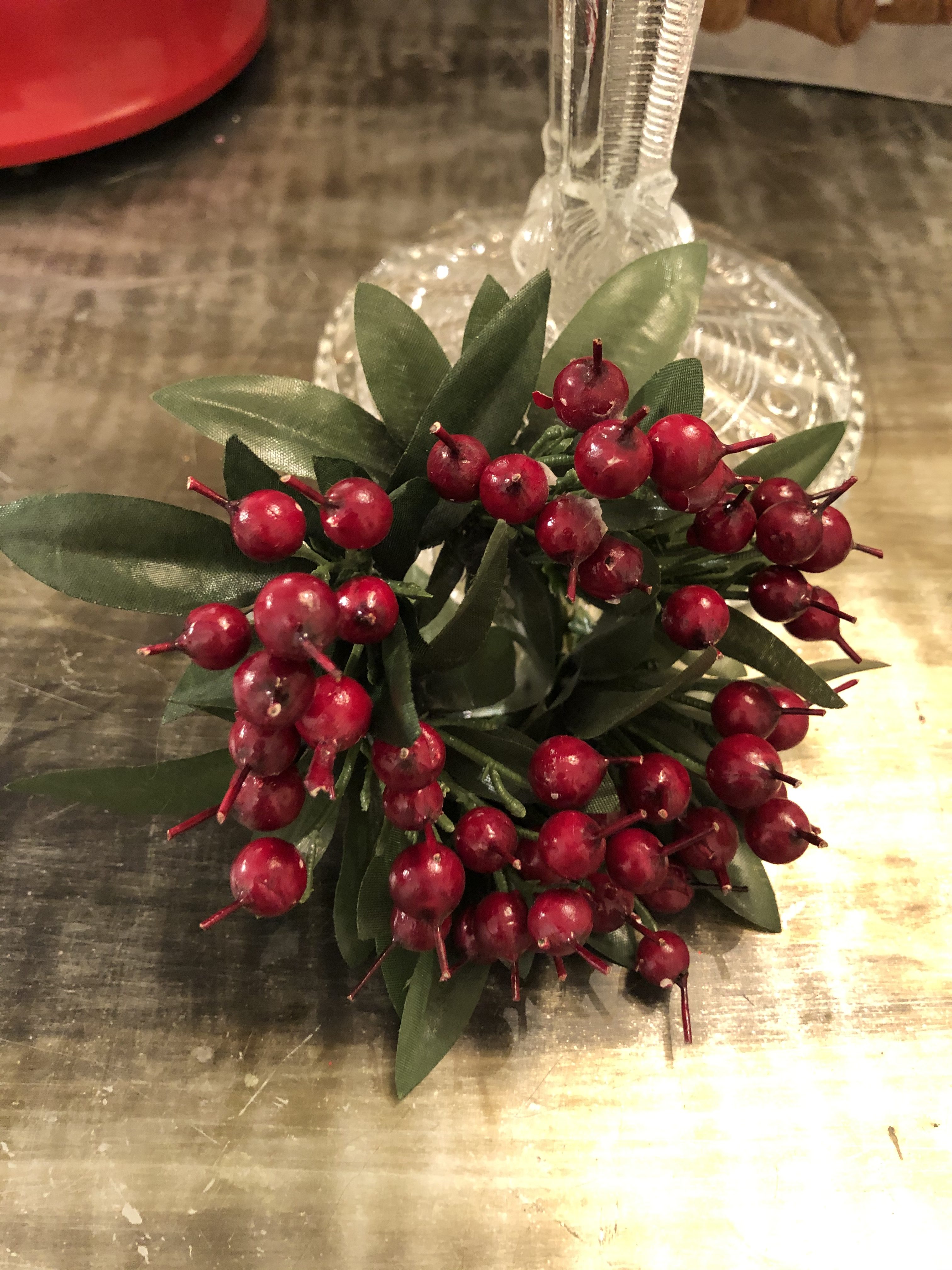
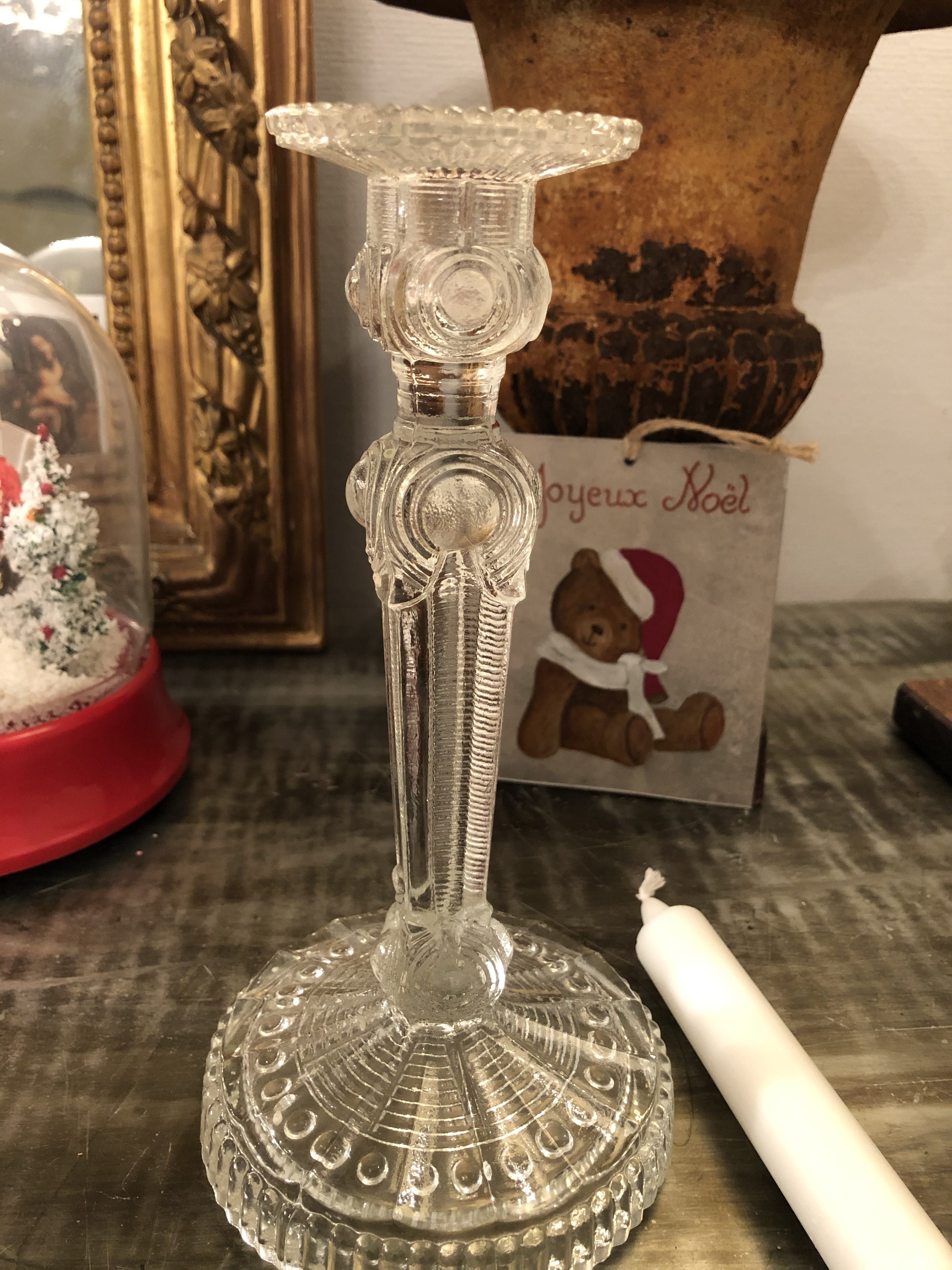
Ce bougeoir en verre au look un peu vintage est vendu avec une bougie blanche (ou une bougie rouge au choix) et une couronne scandinave  rouge et verte .  

Dimensions : Ht 22 cm

VENDU

 Prix : 20€ hors frais de port

bougeoirenverreetbougie

20€ hors frais de port

Je pense qu’il est utile de préciser  que ces articles chinés, ont une histoire et peuvent comporter à cause de leur grand âge quelques imperfections  bien pardonnables


Commentaires

644 réponses à “Bougeoir en verre vintage, bougie et couronne de bougie”

  1. Therefore, I used the CDM sequential speeds as a baseline for my judgment, but placed more value in the practical tests.

  2. I am sure this post has touched all the internet viewers, its really really fastidious paragraph on building up new blog.

  3. Hi, I do believe this is a great blog. I stumbledupon it ; ) I will come back once again since I book marked it. Money and freedom is the best way to change, may you be rich and continue to help others.

  4. Ahaa, its fastidious conversation about this paragraph here at this webpage, I have read all that, so at this time me also commenting at this place.

  5. Everyone loves what you guys tend to be up too. Such clever work and reporting! Keep up the fantastic works guys I’ve included you guys to our blogroll.

  6. I like what you guys tend to be up too. Such clever work and coverage! Keep up the superb works guys I’ve incorporated you guys to my blogroll.

  7. I needed to thank you for this wonderful read!! I certainly loved every bit of it. I’ve got you saved as a favorite to look at new things you

  8. It’s very trouble-free to find out any topic on net as compared to textbooks, as I found this post at this web page.

  9. I’ll right away take hold of your rss feed as I can not in finding your e-mail subscription link or e-newsletter service. Do you have any? Kindly allow me recognize in order that I may just subscribe. Thanks.

  10. I’ll immediately take hold of your rss feed as I can’t in finding your e-mail subscription link or e-newsletter service. Do you’ve any? Please permit me know so that I could subscribe. Thanks.

  11. A person essentially help to make severely articles I might state. That is the first time I frequented your web page and so far? I surprised with the analysis you made to make this actual submit incredible. Fantastic job!

  12. Youu madde soime good point there. I cheked onn tthe internhet ffor moe info bout the issue and found mosxt peoplke wijll ggo aalong wwith yokur views on thks weeb site.

  13. I’ll immediately snatch your rss feed as I can’t find your email subscription link or e-newsletter service. Do you’ve any? Kindly permit me know in order that I could subscribe. Thanks.

  14. This is a topic that is close to my heart… Best wishes! Where are your contact details though?

  15. Hi! Someone in my Myspace group shared this site with us so I came to give it a look. I’m definitely loving the information. I’m book-marking and will be tweeting this to my followers! Great blog and terrific style and design.

  16. These are truly fantastic ideas in concerning blogging. You have touched some pleasant points here. Any way keep up wrinting.

  17. Spot on with this write-up, I really believe that this website needs much more attention. I’ll probably be returning to see more, thanks for the information!

  18. Ahaa, its pleasant conversation concerning this paragraph at this place at this web site, I have read all that, so now me also commenting here.

  19. I will right away grasp your rss feed as I can’t find your e-mail subscription link or newsletter service. Do you’ve any? Please let me recognize in order that I may subscribe. Thanks.

  20. Wow, this article is good, my sister is analyzing these things, thus I am going to tell her.

  21. I just couldn’t leave your site prior to suggesting that I actually enjoyed the usual information a person supply to your visitors? Is gonna be again continuously to check up on new posts

  22. Fantastic web site. Lots of useful info here. I am sending it to several pals ans additionally sharing in delicious. And of course, thank you for your sweat!

  23. Ahaa, its pleasant dialogue about this piece of writing at this place at this web site, I have read all that, so at this time me also commenting at this place.

  24. Hello! I’ve been following your web site for a long time now and finally got the courage to go ahead and give you a shout out from Austin Tx! Just wanted to say keep up the good work!

  25. Hi, i think that i saw you visited my site so i came to “return the favor”.I’m attempting to find things to enhance my site!I suppose its ok to use some of your ideas!

  26. I don’t think the title of your article matches the content lol. Just kidding, mainly because I had some doubts after reading the article. https://www.binance.com/register?ref=IXBIAFVY

  27. lasix furosemide 40 mg

    lasix furosemide 40 mg

  28. zithromax z pak

    zithromax z pak

  29. finasteride medication

    finasteride medication

  30. diflucan 150 mg fluconazole

    diflucan 150 mg fluconazole

  31. Avatar de Leonellak
    Leonellak

    Профессиональная: оклейка авто защитной пленкой – сохраните родное лакокрасочное покрытие в идеальном состоянии на долгие годы.

  32. Avatar de PhillipThuff
    PhillipThuff

    пин ап скачать https://hr-kafedra.ru

  33. Avatar de MichaelSes
    MichaelSes

    Volvo в Україні https://novosti.stck.me/post/1800412/Kupit-spetstekhniku-SDLG-v-Ukraine/ екскаватори, фронтальні навантажувачі та дорожні машини. Надійність, ефективність і сучасні рішення для будівництва. Продаж, підбір і обслуговування техніки для бізнесу.

  34. Avatar de Robertbidge
    Robertbidge

    пинап казино вход https://hr-kafedra.ru

  35. Avatar de Justinped
    Justinped

    Нужны заклепки? заклепка вытяжная 5 сталь прочный крепеж для соединения деталей. Алюминиевые, стальные и нержавеющие варианты. Надежность, долговечность и удобство монтажа для различных задач и конструкций.

  36. metoprolol tartrate 50 mg tablets

    metoprolol tartrate 50 mg tablets

  37. Avatar de Patrickcib
    Patrickcib

    ответственное хранение услуга ответственное хранение цена

  38. Avatar de Timothytrany
    Timothytrany

    дизайнер квартиры москва заказать дизайн проект квартиры

  39. Avatar de WilliamTix
    WilliamTix

    Лучшее путешествие джип туры Крым горы, каньоны и побережье. Увлекательные маршруты, опытные гиды и яркие впечатления от путешествий по Крыму.

  40. Avatar de Thomasvop
    Thomasvop

    Do you trade cryptocurrencies? click here automate your transactions and earn passive income. Smart algorithms analyze the market and help you make decisions. Increase your income and reduce risks with modern technology.

  41. macrobid 100 mg capsule

    macrobid 100 mg capsule

  42. Avatar de Josephbag
    Josephbag

    флаг по индивидуальному заказу флаг на заказ недорого

  43. Avatar de Michaellip
    Michaellip

    Хочешь оригинальную подушку? https://dakimakura-print.ru комфорт и уют для сна. Длинная форма, мягкий наполнитель и стильные принты. Отлично подходит для отдыха и расслабления.

  44. Avatar de CalvinLof
    CalvinLof

    Нужен пластический хирург? https://plasticheskaya-hirurgiya-klinika.ru современные операции и эстетические процедуры. Опытные хирурги, безопасные методики и индивидуальный подход. Консультации, диагностика и качественный результат.

  45. Avatar de JimmyReabs
    JimmyReabs

    Нужна мебель? производство мебели на заказ эксклюзивные изделия из натурального дерева. Индивидуальный дизайн, качественные материалы и точное изготовление. Решения для дома и бизнеса.

  46. Avatar de Michaelleamb
    Michaelleamb

    Нужна премиум мебель? деревянная мебель из массива изготовление на заказ. Натуральные материалы, эксклюзивный дизайн и долговечность. Решения для дома и бизнеса с высоким уровнем качества.

  47. Avatar de Andrewtoult
    Andrewtoult

    премиальная мебель мебель из массива древесины

  48. doxycycline hyclate 100 mg cap cost

    doxycycline hyclate 100 mg cap cost

  49. Avatar de LamontEvono
    LamontEvono

    Наша лучшая подборка: https://albinagoncharova.ru

  50. Avatar de WilliamBrasp
    WilliamBrasp

    Building sustainable ROI on Instagram requires moving beyond trending audio and heavily filtered aesthetics to focus on structural fundamentals that drive conversions regardless of platform algorithm shifts. https://npprteam.shop/en/articles/instagram/creatives-for-advertising-on-instagram-3-proven-video-structures/ provides media buyers, performance marketers, and in-house creative teams with the exact templates and reasoning behind why certain video patterns outperform others in the Instagram environment. The three structures presented are grounded in conversion psychology and real-world campaign data, allowing you to produce high-performing creatives consistently without relying on external creative agencies. Whether you’re managing a single brand account or scaling across multiple verticals, these frameworks accelerate your time-to-profitability by standardizing your video production workflow and testing methodology. Access this resource today to align your creative strategy with proven conversion drivers.

  51. Avatar de GrahamMon
    GrahamMon

    Требования к карме Reddit в 2026 для постинга заметно выросли и теперь варьируются в зависимости от суbreddit и типа контента. Платформа использует карму как сигнал доверия, и низкий порог делает контент невидимым для большинства пользователей даже при успешной публикации. Материал детально объясняет пороги для разных сообществ, как карма влияет на рейт-лимиты и видимость постов, а также механику накопления очков через качественные комментарии и посты. Специалисты по контенту и специализированные маркетинговые агентства используют эту информацию для ускорения адаптации новых аккаунтов и планирования реалистичных сроков запуска кампаний. Понимание точных пороговых значений позволяет избежать импульсивных покупок неподготовленных аккаунтов и выстроить долгосрочную стратегию.

  52. In comparisons of structured e-commerce interfaces, a strong example is Violet Harbor Shopping House which features clean structure overall, makes browsing feel smooth and simple, helping users transition between pages with minimal effort or confusion.

  53. When analyzing online retail platforms built for usability and organization, one standout example is Pebble Vendor Willow Studio where everything feels tidy and the experience is quite user friendly, helping users navigate content quickly without confusion or clutter.

  54. Across various UX studies of digital marketplaces, a strong example is Lantern Orchard Experience Lounge where smooth browsing with a calm design and easy page transitions, allowing users to browse comfortably through well structured and visually balanced pages.

  55. While evaluating e-commerce platforms optimized for usability and design balance, a notable example is Lemon Brook Trade Corner where easy to navigate and everything is clearly presented without clutter, allowing users to interact with content in a straightforward and efficient manner.

  56. Across various e-commerce experience evaluations focused on usability, a notable example is Frost Glade Network Vault where feels structured and simple, making it easy to explore content, helping users interact with a clean and efficient browsing environment.

  57. My browsing session wasn’t very engaging until I reached this well-arranged outlet midway, and I appreciated how easy it was to move between pages thanks to its smooth and logical flow.

  58. While casually exploring different online platforms without any expectations, I stumbled upon a polished retail page midway, and I appreciated how everything was arranged in a way that made exploring much more enjoyable and visually clear.

  59. While casually exploring multiple online pages and not expecting much, I stumbled upon this stylish shop hub midway, and it seemed like a place worth revisiting for more helpful and interesting content later on.

  60. pole-haus.com – Really nice design and easy browsing experience overall today here

  61. Across different e-commerce interface evaluations emphasizing clarity and speed, a strong example is Summit Amber Trade Marketplace which delivers smooth experience overall, pages feel fast and easy to use, ensuring a consistent and distraction-free browsing experience throughout the site.

  62. During an in-depth UX study of ecommerce prototypes focused on navigation behavior and visual clarity I encountered a product section featuring Valley Hall Boutique Opal Store within a grid layout – the design felt minimal and effective and made it easy to browse without getting overwhelmed by unnecessary elements.

  63. During a general search through multiple sources and ideas, I noticed something that appeared mid-content access it here and while I’m uncertain about its purpose, it seems distinct enough to be worth exploring further

  64. While checking out different sources and creative materials, I encountered something embedded within the text take a look here and it brings a really nice energy that keeps the content feeling fresh and interesting to read

  65. While testing different ecommerce UI systems for usability performance and interface consistency I navigated a product feed containing a href= »//emberforesttradingpost.shop/](https://emberforesttradingpost.shop/) » />Forest Trading Post Ember Hub within a sidebar module, – it was quite easy to browse through different sections smoothly which made the interface feel user friendly and simple to interact with overall

  66. Across digital storefront evaluations emphasizing usability and structure, a notable example is Orchard Upland Commerce Hub which maintains well structured pages and browsing feels natural and efficient, helping users move through content without confusion or unnecessary friction.

  67. reddingroyalsfc.com – Great football club updates and match info feel engaging site

  68. During a general exploration of gardening knowledge platforms, I came across something placed within the content take this link and it offers beautiful gardening content that is calming, informative, and very helpful for beginners today

  69. During my search through different property information pages online, I found something within the text check this address listing and it gives a nice presentation that clearly shows what is being offered, making the details easy to understand

  70. While browsing different websites, I discovered a refined trade collective page and it felt like a well-maintained site with content that was carefully structured and thoughtfully presented overall.

  71. During a detailed review of experimental e-commerce interfaces for usability insights, I studied navigation structure and discovered Commerce Hub Forest View which felt modern – pages loaded quickly and overall browsing was smooth.

  72. Clean user interfaces in vendor studios often improve productivity by reducing unnecessary steps between browsing actions, making it easier for users to focus on relevant listings and categories Vendor Studio Clean Layout supporting smooth interaction and clearer visual hierarchy – the platform feels well balanced and easy to understand

  73. As I was going through various document management and productivity websites, I encountered something within the text explore this document system and it functions as a useful document solutions platform that feels efficient and well organized overall

  74. robjordanforcongress.com – Campaign website shares policies and vision in clear manner today

  75. While reviewing different voter information and campaign websites, I noticed something embedded mid-content check this site and it is a political platform sharing policies and vision in a clear structured format for the public

  76. While analyzing ecommerce UI mockups for structure and navigation flow I came across a browsing interface containing a href= »//jewelridgevendorvault.shop/](https://jewelridgevendorvault.shop/) » />Vendor Jewel Ridge Vault Hub embedded in a structured grid layout, – Everything is clean and offers a calm browsing experience overall allowing users to explore content easily without distraction or unnecessary complexity in design

  77. As I continued exploring different web-based informational platforms, I found something placed within the content view this page and after a short look, it offers a clean design and very smooth navigation overall

  78. While researching nonprofit healthcare and wellness initiatives online, I came across something embedded within the content visit this charity foundation and it is a charity organization supporting hair restoration and raising global community awareness efforts

  79. During my exploration of informational awareness platforms, I came across something within the text view initiative site and it is an important initiative overall, with content that feels meaningful and well presented in a structured way

  80. While exploring different meaningful and idea driven websites, I came across something embedded mid-way view this concept and the idea is inspiring, making it stand out from the rest in a very noticeable way

  81. While examining environmental protection and wildlife awareness platforms, I discovered material featuring nature wetlands swan alliance page embedded in ecological conservation content – this reflects collaborative efforts to protect mute swans and preserve wetland habitats through structured environmental initiatives and community-driven biodiversity support programs

  82. While exploring various construction portfolios and material showcases, I found granite finish gallery – The photos highlight impressive workmanship, and the overall presentation reflects a high level of attention to detail in each project.

  83. The pleasant surprise about this tracking dashboard – Is that beyond the reliable stats, the clean interface makes even complex data feel approachable and far less intimidating than other platforms.

  84. As I browsed through several modern fashion and creative portfolios, I noticed something placed within the content discover this designer site and it has elegant design and smooth navigation that gives a very refined and pleasant browsing experience

  85. As I continued exploring various environmental and sustainability initiatives, I noticed something embedded in the content learn more here and it is a nature focused organization promoting environmental awareness and continuous conservation efforts overall

  86. sebastianbachlive.com – Live music updates and performances from Sebastian Bach online now

  87. As I explored different online platforms showcasing unique product collections, I found it appropriate to mention explore this selection within this sentence – the concept stood out as stylish and carefully arranged in a way that feels intentional.

  88. During a casual exploration of regional media platforms and local commentary websites, I found local reporting page – The content carries a strong community feel, and some takes are engaging enough to be worth reading more than once.

  89. While browsing music-related websites and fan pages for alternative rock bands, I came across alternative rock band page – The overall vibe feels really engaging and well structured, with content that keeps your attention and is clearly put together with care and consistency throughout.

  90. During a structured usability study of ecommerce prototypes for navigation behavior and UX consistency I explored a browsing dashboard featuring a href= »//amberwillowmarketplace.shop/](https://amberwillowmarketplace.shop/) » />Willow Marketplace Shop Amber Space embedded within a catalog layout, – everything feels pleasant and smooth with content neatly arranged across pages making navigation easy and intuitive

  91. In the middle of exploring positivity and happiness-based websites, I encountered something mid-content explore this page and it has a light cheerful vibe overall, with content that feels naturally uplifting and pleasant

  92. Click here for more details – The way the content is structured makes the material really simple to grasp and navigate.

  93. As I explored different online resources related to emotional well-being and personal support, I discovered wellness guidance page – The approach feels honest and practical, offering clear information without overwhelming users with unnecessary or confusing content.

  94. One thing about this platform – It proves that unique doesn’t mean impractical, offering solutions that are both imaginative and totally doable.

  95. While browsing through civic engagement and political candidate websites, I noticed something mid-content check campaign page and it represents a political campaign site providing candidate information and community outreach goals

  96. During a casual browse for quick file download tools and platforms, I found fast access hub – I downloaded a file and the process felt efficient, clear, and free from unnecessary complications.

  97. From start to finish, this funny website – Maintains a delightful sense of playfulness that makes even ordinary content seem fresh and enjoyable.

  98. In the middle of reviewing personal lifestyle blogs and story-based websites, I found something that caught my attention explore lifestyle blog and it feels authentic overall, with content that comes across as very personal and easy to relate to

  99. As I explored diet coaching platforms and nutrition consulting resources, I encountered a section containing paleo lifestyle wellness advisory embedded in health education content – this service focuses on helping clients implement paleo nutrition strategies and maintain long-term wellness through expert dietary guidance and coaching support

  100. During a UX comparison of ecommerce systems for navigation clarity and flow I examined a product listing page featuring a href= »//harborlakefrontboutiquehub.shop/](https://harborlakefrontboutiquehub.shop/) » />Boutique Lakefront Harbor Exchange within a structured grid system, – The interface’s clean presentation makes browsing feel simple and stress free overall supporting easy navigation and reducing any potential confusion while exploring content

  101. While browsing unique lodging options and scenic vacation spots online, I found cozy island escape – The atmosphere feels warm and relaxing, and it immediately made me curious about flight prices to Hawaii for a future trip.

  102. As I was going through various cultural festival and event memory websites, I encountered something within the text explore this festival page and it is an event archive site preserving memories of past celebrations and long standing traditions

  103. Users searching for reliable vendor information often need platforms that combine simplicity, structure, and fast access to categorized data Pearl Cove Listings Navigator making exploration more efficient and reducing time spent searching – the design emphasizes organized presentation for better usability

  104. While exploring creative photography portfolios and travel storytelling projects online, I came across a beautifully curated section featuring travel photography storytelling portfolio and it showcases visual journeys from different destinations, blending adventure and artistic composition to create immersive image-based narratives that highlight culture, landscapes, and personal travel experiences

  105. While looking into wineries and specialty wine collections, I came across wine collection page – It’s the kind of place that would interest anyone passionate about wine, and the ice wine selection really catches the eye.

  106. While going through different mission oriented websites and informational resources, I noticed something within the content discover more here and it has nicely organized purpose driven content that makes exploration simple and smooth

  107. While browsing casually during lunch and clicking through random sites, I stumbled upon random exploration page – It was an unexpected find during downtime, but it wasn’t bad at all and actually held a bit of surprising interest for a short visit.

  108. While looking for interesting sites, I came across this well‑organized page – The way everything is arranged makes moving from one section to another feel completely natural and surprisingly effortless.

  109. While going through several niche artisan websites for comparison and research, I came across dawn canyon product atelier page during my evaluation of product display methods and it seemed well organized and easy to navigate – I found it to be a fairly positive and potentially useful discovery.

  110. yogaonethatiwant.com – Yoga focused platform promoting wellness and mindful practice every day

  111. My experience browsing various pages improved when I found this organized retail hub midway, and I liked how structured everything was, allowing for a smoother and less confusing browsing experience.

  112. As I continued browsing lifestyle and creative web platforms, I found something placed within the text see clocktower page and it has a unique feel that makes exploring its offerings quite interesting and refreshing overall

  113. As I explored different fusion cuisine spots and food photography pages online, I stumbled upon modern dining link – The cultural blend is done in a really interesting way, and the food pictures honestly made me hungry right away.

  114. узаконивание перепланировки квартиры pereplanirovka-kvartir15.ru .

  115. While exploring different wellness resources online, I came across a helpful platform featuring mindful yoga lifestyle hub that focuses on daily practice routines and holistic health guidance – it presents a calm, structured approach to improving flexibility, breathing, and mental clarity through consistent yoga sessions and guided instruction for all levels.

  116. As I explored different sensory learning and therapy support websites, I stumbled upon education support link – The resource feels structured and easy to understand, offering helpful information that works well for teachers and parents managing sensory needs.

  117. Exploring modern wellness platforms, I found conscious movement yoga hub that focuses on intentional body awareness – it guides users through mindful yoga flows that strengthen the body, improve posture, and encourage relaxation through structured breathing and consistent daily practice routines.

  118. While browsing through several experimental ecommerce layouts for usability testing and interface clarity comparisons across different demo environments, I explored a structured product grid where I came across Silk Lakefront Goods Market Hub embedded within a catalog section, and – the overall design felt very clean and minimal, with no distracting elements, making it easy to focus purely on browsing through pages smoothly and comfortably.

  119. While going through various links without much expectation, I encountered this handy store page right in the middle, and its neat design along with clear structure gave me a genuinely good impression from the start.

  120. As I explored curated movie lists for children and safe viewing resources, I stumbled upon safe movie portal – It’s refreshing to find a site that keeps things simple and focused, avoiding hidden agendas and unnecessary distractions entirely.

  121. While comparing multiple online commerce environments for usability consistency and interface performance across different devices and browsers I reviewed Kettle Marketplace Network Hub – and found the layout to be stable with fast transitions and clean sections that made navigation straightforward and easy overall experience.

  122. While conducting usability comparisons across multiple online marketplace demos for interface clarity and speed optimization, I examined a catalog interface containing Lavender Harbor Digital Trading Panel embedded in a category feed, and everything felt well organized – browsing through items was quick and visually comfortable with no confusing elements.

  123. I was impressed by how this seasonal celebration website – Balances a fun, holiday‑appropriate design with practical organization, so nothing important gets buried under too many decorations.

  124. At one point during my browsing journey, I landed on this accessible outlet page and I noticed how simple navigation felt, contributing to a smooth overall experience.

  125. During a routine search across different online platforms, I noticed something placed right within the content, go to this link, and it feels very fresh with an easy browsing experience that is smooth and pleasant

  126. As I browsed through city apartment guides and urban lifestyle blogs, I stumbled upon urban housing hub – The advice is practical and well structured, making it easier for newcomers to navigate rent, neighborhoods, and city living challenges.

  127. While scrolling through curated online articles and magazine-style content, I encountered a nicely placed reference, Julia James feature space, and the layout is clean, organized, and genuinely pleasant to read with a sense of structure throughout the page

  128. Digital content planners and information design analysts often review how web pages balance readability with structured presentation balanced_content_layout – The page offers a clean arrangement that enhances comprehension while ensuring users can navigate through sections without difficulty or confusion

  129. While reviewing various archive-style websites and informational pages online, I stumbled upon something naturally placed in context, explore this historical site, and it is quite an interesting website where I came across useful details during my exploration of different pages today

  130. During my exploration of casual entertainment and lifestyle websites, I came across something within the text view fun site and it looks interesting overall, presenting a relaxed and fun casual destination that feels enjoyable to browse

  131. While conducting research on e-commerce food services I noticed practical grocery exploration site appearing within search results and it looked promising – the interface feels balanced and user friendly, allowing visitors to browse content without friction or unnecessary complexity in structure overall

  132. At some stage during my browsing of informational resources, I came across something placed within content, check this page, and it shows clear awareness messaging with a simple layout overall

  133. In comparisons of online shopping platforms emphasizing usability and clarity, a notable example is Willow Dawn Unified Atelier which delivers pages are well organized and content is easy to understand quickly, ensuring a calm, structured, and intuitive browsing experience throughout the platform.

  134. перепланировка квартиры в москве pereplanirovka-kvartir16.ru .

  135. In comparisons of online commerce systems focused on clarity and user experience, a standout example is Stone Harbor Unified Hub which delivers nice layout with clear sections and straightforward navigation flow, ensuring a smooth and structured experience across the entire platform.

  136. I had been scrolling through several unrelated pages until halfway I reached a neat marketplace hub and I noticed a good overall impression forming as both content and layout felt balanced and easy to understand.

  137. While reviewing e-commerce systems designed for structure and simplicity, a strong example is Pebble Willow Unified Studio where everything feels tidy and the experience is quite user friendly, making navigation predictable, clean, and easy for all users.

  138. During a casual exploration of positivity focused websites, I noticed something embedded in the middle of content, check uplifting smiles hub, and the platform delivers an enjoyable and emotionally positive browsing experience overall

  139. While reviewing a mix of lifestyle and wellness content websites, I came across something naturally placed, open and see, and it feels pretty cool with a modern interface that is simple and easy for visitors to use

  140. As I continued exploring various food and ecommerce style websites, I noticed something embedded in the content learn more here and it shows an interesting idea blending food and shopping into a unified online experience

  141. As I was reviewing different pet print and animal art websites, I found something embedded in the text visit dog print site and it features adorable pet-related prints that are highly recommended for animal lovers everywhere

  142. At some stage during my browsing, I came across something placed within the content, check this page, and it is a helpful resource where I found useful tips and ideas while exploring various sections today

  143. Residents and community members seeking election updates often review official platforms and informational pages where transparency is emphasized campaign information portal to better understand local policy priorities and outreach efforts – The website is often described as clear, direct, and structured for easy public understanding of policy positions

  144. I was browsing through multiple ideas when something caught my attention midway, view this page, and it seems like the content has been carefully crafted to be both informative and meaningful

  145. I didn’t expect much while browsing randomly, but something appeared that caught my attention, check more info, and it offers solid content that is updated and nicely organized for a pleasant learning experience

  146. Local creators and cultural advocates often seek online environments that support shared expression and collaborative projects across different mediums, and they may discover artistic collaboration zone – This platform encourages partnerships, exhibitions, and workshops that highlight collective creativity and community involvement.

  147. Across various marketplace usability analyses, a notable platform is Stone Ember Market Vault which delivers clean and modern look makes the browsing experience quite pleasant, ensuring a stable and organized browsing experience across all categories and listings.

  148. During my exploration of seasonal celebration pages, I encountered see festival info – The site provides a refreshing browsing experience with content that feels relevant, helpful, and well organized for easy understanding and navigation.

  149. As I explored various biodiesel and renewable energy sites, I encountered view backyard fuel project – It turned out to be an interesting resource, and I picked up new knowledge while simply browsing through the content.

  150. As I moved through different group productivity tools, I found something in between the content, explore collaboration hub, and it delivers a structured environment for teamwork and coordination overall

  151. cialis pill cost

    cialis pill cost

  152. While casually browsing a variety of dessert baking websites, something appeared in context, see details, and I like the platform since it feels reliable and easy to navigate with clear organization

  153. While browsing entertainment-focused online spaces, I found open fun content page – The overall vibe is cheerful and relaxed, and the content feels light, making it pleasant and easy to explore.

  154. Voters and community members often search for reliable election resources that summarize candidate perspectives and provide accessible information about campaign goals civic vision page – The site outlines candidate vision in a clear format designed to help readers understand policy intentions quickly

  155. While browsing through a variety of articles and discussions earlier today, I came across something placed naturally within the content flow, check this resource, and it really feels like an important topic is being highlighted in a way that helps spread meaningful awareness

  156. While going through multiple opinion blogs, I found something in the middle of everything, see northern forum page, and it presents engaging and structured viewpoints overall

  157. While scanning through various baking recipe websites, I came across something within the content flow, click to view, and I like the platform since it feels reliable and easy to navigate with a clean structure

  158. While reviewing digital storefront platforms emphasizing structure and speed, a strong example is Gilded Willow Unified District where well organized layout and pages load quickly and smoothly today, making navigation consistent, intuitive, and easy for all users.

  159. While searching through emotional wellness platforms, I stumbled upon open this resilience story page – The content feels heartfelt and meaningful, and it is presented in a way that feels thoughtful and genuinely relatable throughout.

  160. Users looking for motivational reading material frequently explore platforms centered on human perseverance and recovery journeys and they come across second chance reflections – The content often encourages readers to reassess their own paths while finding hope in the experiences of others who overcame difficulties and rebuilt their lives.

  161. As I continued exploring various transportation and mobility information websites, I noticed something embedded in the content learn more here and it serves as a transport information site helpful for commuters with daily updates

  162. As I browsed fast and minimal websites, I came across view quick performance page – The interface is clean and simple, with fast loading times and smooth operation that creates a very pleasant browsing experience.

  163. mitchwantssununu.com – Interesting concept site, content feels direct and somewhat thought provoking today

  164. During my search for sustainability-focused information, I encountered open this energy learning site – It turned out to be an interesting resource, and I gained new insight simply by exploring it briefly.

  165. While exploring various online stores and digital platforms earlier today, I came across something placed naturally within the browsing flow, check this shop, and it really feels like a cool platform where navigation is smooth, pages load quickly, and the overall experience feels efficient and easy to use

  166. As part of my research into festive online experiences, I came across explore this festival – The information is presented in a fresh and engaging way, making it enjoyable for users to browse while still feeling informative and practical.

  167. When analyzing modern online shopping platforms built for user experience, one standout example is Frost Vendor Glade Vault where feels structured and simple, making it easy to explore content, helping users move through categories efficiently without unnecessary clutter or distraction.

  168. People who prefer countryside inspired online shops often engage with platforms like Cove Wheat Market Outpost where the browsing experience is designed with simplicity and comfort in mind – The rustic layout enhances usability by keeping product sections clear and visually calm, allowing users to enjoy a smooth and intuitive shopping journey throughout the site.

  169. While going through sustainability-related platforms, I found explore this eco fuel site – The content is quite useful, and I learned something new just by casually checking what the site had to offer.

  170. Users exploring bright ecommerce marketplaces often appreciate how well structured layouts improve browsing comfort when visiting sites such as Sun Cove Goods District Hub where products are arranged in a clean and organized shopping environment that feels easy to use – The shop feels bright and highly organized, making browsing smooth, enjoyable, and visually clear so users can quickly find items without confusion or clutter.

  171. Users who value artisan style ecommerce platforms often respond well to layouts that emphasize simplicity, warmth, and structured visual storytelling across product collections gilded cove artisan emporium – The browsing experience feels thoughtfully arranged, offering a smooth flow where each product category is easy to find and visually appealing to explore.

  172. While browsing curated island getaway options featuring boutique accommodations, I came across a refined and visually appealing property listing recently < tropical hillside inn tour – The content feels inviting and easy to follow, presenting the location in a calm and aesthetically pleasing way overall

  173. While browsing opinion oriented personal websites that focus on direct messaging and reflective commentary I came across a platform featuring political commentary hub – the content feels straightforward in tone and sometimes encourages deeper thinking about current viewpoints and public discourse in a fairly minimal presentation style overall

  174. Academics studying folklore and heritage frequently consult online festival archives that preserve visual media written records and audience experiences folk_festival_archive to better understand how traditions are maintained adapted and shared across communities participating in cultural celebrations each year worldwide networks

  175. During my search for funny and entertainment-based platforms, I noticed check this humor page – The overall vibe is playful and enjoyable, with content that feels lighthearted and easy to engage with while casually browsing through.

  176. In evaluations of e-commerce platforms focused on structure and clarity, a strong example is Gilded Brook Commerce District where nice visual balance and navigation works without any confusion, helping users explore products efficiently through well structured categories and layouts.

  177. As part of my research into festive online experiences, I came across explore this festival – The information is presented in a fresh and engaging way, making it enjoyable for users to browse while still feeling informative and practical.

  178. Users who appreciate simple marketplace design often browse sites such as Kettle Harbor Commerce Flow Hub where products are presented in a minimal structured layout – The interface makes browsing feel easy, intuitive, and easy to understand across categories.

  179. Users who appreciate clean ecommerce organization often browse platforms such as Cove Sun Goods District Bright Market Hub where products are presented in a neat and structured format – The interface creates a smooth browsing experience that feels easy, clear, and enjoyable throughout the store.

  180. People who enjoy clean digital storefronts often prefer vault-style ecommerce designs that keep everything organized and visually easy to scan at a glance Harbor Glass Vault Display – The interface is minimal and polished, ensuring browsing feels smooth, intuitive, and visually consistent from category to category.

  181. As I continued going through various performing arts and theatre community websites, I encountered something within the text see more here and it is a theatre group promoting arts and local performance events

  182. modelscanvas.com – Creative portfolio vibe, visuals and layout feel clean and professional design

  183. Users who prefer modern artisan marketplaces often engage with sites such as Wave Artisan Trail Market where product listings are displayed in a clean and visually appealing format – The design supports easy navigation and highlights creativity, ensuring each item feels thoughtfully presented and easy to browse through structured categories.

  184. While exploring modern digital supermarket ideas, I found a clean and concept driven website that emphasizes clarity and ease of use hope online market system – The design is simple yet functional, making navigation intuitive and the overall idea easy to follow

  185. While casually browsing a variety of discussion forums, something appeared in context, see details, and the site works fine overall with a clean and user-friendly layout that is easy to navigate

  186. While searching through emotional wellness platforms, I stumbled upon open this resilience story page – The content feels heartfelt and meaningful, and it is presented in a way that feels thoughtful and genuinely relatable throughout.

  187. Across various online retail usability evaluations, a strong example is Night Glade Experience House where everything feels straightforward and browsing is comfortable and stable, allowing users to browse comfortably through well organized and visually balanced pages.

  188. As I browsed multiple nonprofit and support websites, I noticed read more here – The platform presents information in a simple and practical way, ensuring users can quickly understand the key points without confusion.

  189. Academic researchers analyzing political communication patterns frequently examine campaign websites to understand how candidates present their platforms to diverse audiences candidate outreach site – The campaign information includes structured policy summaries and engagement updates aimed at maintaining consistent communication with voters across regions

  190. People who appreciate artisan focused ecommerce design often browse platforms like Cove Vendor Teal Artisan Creative Market where items are arranged in a stylish and structured format – The layout ensures browsing feels smooth, visually appealing, and thoughtfully organized for an enhanced user experience.

  191. While reviewing several informational suggestions online, I noticed something that stood out in context, learn more here, and it provides content that is structured in a way that makes it simple to understand and follow

  192. People who enjoy organized digital vendor spaces often engage with sites like Meadow Apricot Works Vendor Collective where items are presented in a simple layout – The interface makes browsing creative, clear, and easy to manage.

  193. While browsing curated modeling and design showcases I found a platform that emphasizes visual clarity and simplicity using model and art showcase – the presentation feels refined and organized creating a professional impression for visitors exploring the content

  194. As I browsed various online offers and resources, I encountered view this bonus resource page – I found it today and it appears useful overall, with a nicely presented layout that feels simple and easy to navigate.

  195. As I moved through different campaign platforms online, I found something in between the content, explore candidate site, and the site shows clearly structured messaging with informative and organized content overall

  196. Shoppers interested in rugged yet organized online retail environments often browse curated stores like Berry Cove Gear Shop where gear and essentials are displayed in a clean layout that supports both clarity and practical usability – The gear-focused layout ensures durability-oriented products are easy to find and evaluate

  197. While researching luxury wine labels and vineyard brands, I found a structured and visually appealing winery website that emphasizes product detail and elegance icewine heritage brand site – The content feels well organized and engaging, making the wine information both easy to follow and visually impressive overall

  198. Across various UX evaluations of digital marketplaces, a strong example is Sage Harbor Experience Vault where clean design and content is arranged in a logical order, allowing users to browse comfortably through well balanced and structured pages.

  199. As I browsed through multiple wildlife advocacy websites, I noticed read more here – The organization of the content feels intentional and well planned, making the overall experience easy to follow and appreciate.

  200. While exploring social progress organizations, I encountered explore this empowerment network site – The initiative appears meaningful, and the information is clearly structured, making it easy to understand and navigate.

  201. People who appreciate clear digital commerce hubs often browse platforms like Harbor Teal Commerce Direct Hub where items are presented in a clean and accessible format – The design ensures browsing is intuitive, efficient, and well organized for quick product discovery.

  202. проект перепланировки квартиры сро proekt-pereplanirovki-kvartiry27.ru .

  203. Shoppers who prefer minimal ecommerce aesthetics often value clean collective layouts that reduce clutter and highlight products in an organized and visually appealing way Glade Collective Ridge Store – The design feels modern and well structured, offering a browsing experience that is simple, clear, and visually consistent throughout the platform.

  204. While exploring nostalgic style web platforms I found a creatively themed site that captures attention with its visual storytelling including classic memory lane portal – the content evokes a warm retro atmosphere while maintaining an engaging and visually pleasant browsing experience overall

  205. While browsing through community aid and housing support networks, I noticed something mid-content check support page and it is a nonprofit organization providing housing assistance and social support programs

  206. I was going through multiple lifestyle and inspiration pages when something appeared naturally in context, visit here now, and it turned out to be a really helpful site where I found useful insights and enjoyed browsing today

  207. While browsing experimental digital art and web design platforms, I encountered a uniquely structured site with a strong creative identity intermusses design exploration hub – The content feels creatively experimental, with a layout that breaks traditional structure while remaining thoughtfully organized overall

  208. During my search through online entertainment hubs, I found check this squad creative site – The design is visually striking, and the content keeps things interesting, giving a fun and engaging browsing experience.

  209. Shoppers who appreciate artisan quality often find satisfaction in platforms such as Brook Handmade Essence Store where every product reflects careful creative effort and attention to detail – The design highlights authenticity through clean presentation, allowing users to explore handcrafted items without distraction or visual clutter.

  210. While comparing online retail platforms focused on speed and structure, a standout example is Summit Amber Global Marketplace which maintains smooth experience overall, pages feel fast and easy to use, providing a seamless and well-organized browsing journey across all pages.

  211. While exploring different music-related websites and fan pages, I came across visit this music page – The layout feels simple and intuitive, making it easy for visitors to navigate through content smoothly without confusion or unnecessary complexity.

  212. People who appreciate efficient online marketplaces often browse platforms like Harbor Trail Commerce Flow Market Hub where items are arranged in a structured and simple layout – The interface ensures navigation feels user friendly, clear, and easy to use throughout the shopping experience.

  213. Users exploring premium ecommerce emporiums often notice how structured visual layouts improve clarity and help highlight product details in a more refined browsing environment Glass Harbor Emporium Hub – The polished emporium design presents items in a clean and elegant structure, making browsing smooth, visually organized, and easy to navigate throughout the entire experience.

  214. nomeansnoshow.com – Strong identity here, site feels bold and creatively expressive throughout pages

  215. During my search for user-friendly website examples, I noticed check this mill browsing page – The layout is simple and well structured, making navigation smooth and easy to follow across all sections.

  216. While reviewing a mix of different informational websites, I came across something that seemed worth noting, open and see, and it appears to be a trustworthy platform that provides useful and valuable content for readers in a simple structure

  217. While going through multiple hospitality focused sites, I found something in the middle of everything, see hospitality hub, and it delivers a vibrant and engaging browsing experience overall

  218. нейросеть для школьников и студентов nejroset-dlya-referatov-25.ru .

  219. While browsing curated personal profile websites, I encountered a polished portfolio page that emphasizes clarity and professional presentation online career portfolio hub – The navigation feels seamless, and the information is clearly structured for easy understanding and quick access throughout

  220. While analyzing modern retail platforms built for clarity and speed, a notable example is Icicle Lakefront Trade Mart where simple layout and information is easy to find at a glance, helping users interact with content without unnecessary complexity or delay.

  221. карнизы с электроприводом купить elektrokarniz11.ru .

  222. During a comparison of soft aesthetic online stores and their usability, I came across discover velvet willow space – The presentation feels elegant and calm, and browsing across categories is smooth and visually soothing throughout the experience.

  223. Users who enjoy relaxed ecommerce design often engage with sites such as Wave Harbor Ocean Style Outpost where products are presented in a clean coastal inspired layout – The design focuses on simplicity and comfort, making browsing feel smooth, refreshing, and easy across all categories.

  224. While reviewing various event platforms, I found check this out – The content feels reliable and well structured, offering a consistent level of engagement that makes browsing both simple and enjoyable.

  225. Users who prefer organized online retail systems often respond positively to emporium designs that maintain visual consistency while improving browsing efficiency Glass Stone Emporium Experience – The interface is modern and cohesive, offering a structured shopping journey where products are easy to explore and visually well aligned.

  226. While researching structured online commerce systems and their user experience, I explored browse this meadow linen hub – The layout is clean and efficient, and browsing feels smooth, making the entire experience easy and enjoyable from start to finish.

  227. During my search for unconventional web projects, I noticed check this unique clone site – It stood out as something different, and it definitely feels worth checking out because of its unusual approach and presentation style.

  228. While browsing visually bold online platforms I came across a site that captures attention with its strong creative direction featuring creative impact page – the overall experience feels immersive and reflects a distinct artistic personality across all sections

  229. staystrongforows.com – Supportive initiative, content gives a meaningful perspective overall.

  230. In comparisons of user experience across retail websites, a strong example is Orchard Upland Shopping Hub which ensures well structured pages and browsing feels natural and efficient, supporting seamless transitions between pages and product sections.

  231. During my exploration of startup resources and online support tools, I came across various helpful platforms and found small business guide hub – The site offers practical guidance, and the content is easy to follow, making it useful for quick learning and real-world application.

  232. While browsing unique cultural fusion websites, I discovered a platform that mixes different stylistic and thematic elements in an appealing digital presentation brooklyn jeddah fusion hub – The experience feels engaging and culturally diverse, offering a creative blend of ideas that keeps the content visually interesting

  233. Users exploring artisan ecommerce platforms often appreciate how curated layouts improve browsing clarity when visiting sites such as Wind Cove Artisan Trading Market Hub where handcrafted products are arranged in a structured and visually appealing format that feels easy to navigate – The artisan market style is visually appealing, with neatly organized product displays that make browsing smooth, intuitive, and enjoyable across all categories of handcrafted goods.

  234. Digital marketplace enthusiasts often value structured galleria layouts that highlight premium collections and maintain visual consistency throughout browsing sessions Cove Galleria Premium Hub – We emphasize seamless category transitions and carefully curated product grids that support both discovery and comparison ensuring users can quickly locate desired items while enjoying a visually balanced environment designed to enhance engagement and reduce friction during browsing experiences overall

  235. As I browsed various informational platforms, I found open this page – The structure feels clear and reliable, with content that seems valuable and presented in a way that is easy to navigate.

  236. oakmeadowcommercehub – Commerce hub feels organized, categories are clear and easy browsing

  237. nutschassociates.com – Professional services look solid, information is clear and easy to follow

  238. I was browsing through multiple food and restaurant recommendations when something caught my attention midway, view this page, and it contains interesting content that I would surely revisit again later

  239. During my review of business solution platforms and support guides, I came across informative resources and discovered business solutions guide page – The information is practical and clearly structured, helping users quickly grasp key ideas and apply them effectively.

  240. I was going through various gardening inspiration websites when something stood out naturally in context, explore garden site, and it delivers soothing and informative material with a clean and pleasant presentation overall

  241. While studying digital retail atelier interfaces and seasonal design, I explored open mint orchard boutique atelier – I will definitely return here for the holiday season because the browsing experience feels simple, smooth, and pleasant overall.

  242. People browsing handmade product websites frequently look for platforms that balance creativity and usability and might encounter harbor craft violet marketplace offering curated artisan collections with intuitive navigation and clear layout design – A marketplace built to enhance shopping comfort and product accessibility.

  243. While analyzing modern online retail platforms built for usability, a notable example is Frost Lakefront Trade Vault where clean interface and everything is easy to navigate without effort, helping users explore products without unnecessary complexity or visual distraction.

  244. At one point during my browsing session, I encountered something that appeared naturally in context, visit and explore, and it reflects an important cause being highlighted in a thoughtful and positive way

  245. Users who value clean ecommerce outlet design often browse platforms such as Harbor Stone Outlet Essentials Hub where categories are clearly separated – The layout supports simple navigation and quick product discovery, ensuring users enjoy a smooth and practical browsing experience across all sections of the store.

  246. People who enjoy visually peaceful ecommerce galleries often engage with sites like Dawn Galleria Softstone Hub where content is arranged minimally – The design creates a browsing experience that feels soothing, balanced, and easy to visually process.

  247. While browsing creative cross cultural web projects, I encountered a platform that blends different influences into a unified and engaging structure jeddah brooklyn style hub – The website feels diverse and interesting, with a creative mix of themes that makes the browsing experience visually engaging overall

  248. Public health analysts and healthcare writers often review physician websites to evaluate how patient care information is communicated to online audiences healthcare_information_page as part of digital healthcare transparency assessments – It is often presented as an informational healthcare page offering clear details about patient care services and general medical topics for public awareness

  249. While comparing wellness coaching websites, I encountered view holistic diet insights – The clean structure really stands out and makes navigation simple, which adds to the enjoyment of exploring the information provided across the pages.

  250. uplandcovevendorcorner – Vendor corner feels helpful easy browsing and clean layout overall

  251. While exploring outdoor getaway platforms, I came across open camping destination hub – The place looks great, and the information is presented clearly, making it engaging and easy to follow for users.

  252. While exploring corporate style design examples I discovered a site that uses structured layouts effectively with enterprise web hub – the navigation feels intuitive and the content is presented in a clear and professional manner throughout

  253. People who enjoy socially connected ecommerce environments often explore sites like Harbor Pine Trade Collective where the platform reflects a shared marketplace philosophy with active contributions from multiple sellers – The design creates a sense of movement and collaboration, making browsing feel interactive and community centered throughout the store.

  254. In evaluations of modern e-commerce websites emphasizing usability, a strong example is Frost Forest Market Vault where the design feels balanced and content is clearly organized, allowing users to explore products easily through a clean and intuitive layout.

  255. People who enjoy winter styled ecommerce layouts often engage with sites like Ice Isle Chill Market Hub where products are arranged in a fresh and minimal structure – The interface ensures browsing feels light, organized, and visually refreshing, making product discovery easy and efficient throughout the platform.

  256. During a casual browsing session across different event-based initiatives, something caught my attention while reviewing multiple links, have a look, and it feels great to see events that actively support important global issues in a creative and public way

  257. champselyseesclinic – Clean design and helpful content, feels professional and easy to explore.

  258. Civic technology reviewers and political consultants often assess campaign websites to evaluate how candidates structure information for voter accessibility and transparency campaign_connect_page – The site delivers organized policy goals and voter engagement content intended to ensure clarity and maintain consistent communication with the electorate

  259. I came across this quirky volleyball related page while browsing through sports fan content and it immediately stood out for its tone josh inspired sports nook – The site feels creative and casual, delivering a lighthearted approach to sports content that makes it easy and enjoyable to browse

  260. While browsing unrelated topics online, I encountered check this media page – I found it by chance, but it turns out to be quite useful, providing content that is simple and pleasant to explore.

  261. what is vidalista 10

    what is vidalista 10

  262. pair-dating.com – Dating concept looks simple, interface feels straightforward and user friendly experience

  263. Shoppers who enjoy cozy themed ecommerce environments tend to appreciate smooth navigation systems when they come across Cove Ginger Market which focuses on relaxed design flow and readable layouts – The browsing experience is intentionally simplified to help users move through categories without confusion or unnecessary visual distraction

  264. During my search for holiday event inspiration, I noticed check this festive ball site – The theme feels very festive and well designed, and I really like the presentation style, which gives the whole experience a warm and seasonal feel.

  265. Users who value functional ecommerce experiences often browse sites such as Gladestone Outpost Market Flow where layout and branding emphasize simplicity – The interface creates a smooth browsing experience that feels organized, practical, and easy to navigate, supporting quick access to products without complexity.

  266. While reviewing photography travel content online, I encountered view this shoot travel hub – The experience feels very smooth, with intuitive navigation and fast loading pages that make browsing simple and pleasant.

  267. While browsing different online matchmaking tools I came across a site offering social pairing hub – the design looks clean and the navigation is smooth providing a user friendly experience that allows visitors to explore content without confusion or delay

  268. While browsing online housing platforms I came across a site dedicated to Kaufman County real estate that keeps things simple and readable local housing search center – It provides an easy navigation flow and structured listings that help users focus on finding relevant property options quickly

  269. During my exploration of family and parenting blogs, I noticed check chicagoland family blog – The site feels warm and relatable, and the content is genuinely helpful for readers seeking practical parenting guidance and lifestyle ideas.

  270. Users who enjoy wood inspired ecommerce layouts often engage with sites such as Timber Rustic Trail Outpost Market where products are displayed in a warm and simple format – The design focuses on clarity and comfort, making browsing feel smooth, structured, and easy to follow throughout the platform.

  271. During my search for music and entertainment industry websites, I noticed check this artist entertainment site – The overall structure feels solid, and the layout combined with the information flow makes the browsing experience feel smooth and well organized.

  272. piercethearrow.com – Bold branding here, content feels energetic and visually striking creative site

  273. While reviewing accessory and jewelry websites, I encountered view this handcrafted site – The balance between visual design and written content makes the browsing experience feel natural, clean, and engaging throughout.

  274. I was going through various online tools and informational sites when something appeared right in the middle of the content, visit here now, and it feels like a useful platform where everything is structured clearly and easy to follow

  275. While searching entertainment guides for families I found a website dedicated to listing safe films that are appropriate for children and general audiences kids film curation hub – The browsing experience is clear and reassuring, with content that is easy to filter and understand at a glance

  276. People who value curated online marketplaces often browse sites like Stone Golden Collective Showcase Studio where products are arranged in a premium and elegant format – The interface ensures each item feels carefully selected, enhancing the browsing experience with clean design and visually appealing structure.

  277. As I browsed various tracking and management tools, I encountered view this claim utility hub – It appears simple and useful, and the overall structure suggests a practical tool that users can rely on for straightforward tasks.

  278. While exploring modern e commerce interfaces with minimal aesthetics I discovered a platform featuring amber retail space – the calm design style makes browsing comfortable and the layout feels clean and well organized

  279. While exploring modern creative sites I came across a platform presenting artistic showcase portal – the design feels dynamic and the visuals combine to create an experience that is both bold and visually captivating for users

  280. As I explored different structured data websites, I encountered view rtc organization site – The platform feels well organized, helping users easily locate needed information without distractions or complicated navigation paths.

  281. While exploring dessert inspired branding platforms I discovered a site that emphasizes sweet themed visuals with a structured layout that makes browsing simple and enjoyable while maintaining a consistent and appealing aesthetic throughout the pages confectionery design showcase – The visuals feel polished and inviting, with a well organized structure that improves the overall experience

  282. While browsing political commentary platforms, I found open bold discussion site – The content feels very attention-grabbing, and it stands out strongly due to its direct and assertive presentation style.

  283. Users who enjoy handcrafted online shopping experiences often browse platforms such as Harbor Trail Artisan Comfort House where design focuses on warmth and simplicity – The interface creates a welcoming browsing journey that feels easy, visually balanced, and thoughtfully curated across all product sections.

  284. As I explored various online commerce hubs, I checked see meadow linen commerce hub page – The experience is simple and pleasant, and browsing feels smooth and enjoyable with clear organization across the site.

  285. Users browsing for unique handmade marketplaces frequently seek platforms offering both variety and simplicity and in such exploration they might find violet craft harbor collection showcasing artisan made goods with structured navigation and visually appealing presentation – The experience focuses on ease of discovery and enjoyable browsing through curated craft selections.

  286. Users who prefer elegant calm gallery layouts often explore sites such as Galleria Dawnstone Serenity View where items are displayed in a minimal format – The interface ensures browsing feels soft, organized, and easy on the eyes throughout the experience.

  287. preventcovid19trial-uk.com – Informational tone here, content feels research focused and medically structured layout

  288. Across usability studies of modern storefront platforms, a notable example is Harbor Violet Commerce House where clean structure overall, makes browsing feel smooth and simple, creating a predictable browsing experience with clearly separated content sections.

  289. While researching modern marketplaces with soft and elegant aesthetics, I explored browse this willow velvet hub – The layout is gentle and refined, and users can navigate easily while enjoying a smooth and peaceful browsing flow.

  290. As I browsed luxury fashion and jewelry websites, I encountered view diamond elegance hub – The presentation feels elegant overall, and the polished design makes the browsing experience visually appealing and smooth.

  291. Many people who value efficient ecommerce browsing often choose platforms that streamline product discovery, particularly when exploring Meadow Quick Shop Hub where categories are arranged logically, making it easy for users to locate items quickly and complete their shopping experience with minimal effort.

  292. During my browsing of yoga inspiration resources, I came across check this yoga insight page – The concept is quite engaging and thought-provoking, offering something that could be explored further at a later stage.

  293. As I reviewed examples of online retail atelier websites, I checked see mint orchard retail page – This is definitely a site I’ll revisit for the holiday season since everything feels well structured and easy to browse.

  294. While exploring performance and recovery websites for athletes I came across a football therapy platform that delivers practical insights into physical rehabilitation and training support in a simple and structured format that feels easy to follow athlete therapy support hub – The site feels informative and helpful, focusing on practical recovery methods for sports performance

  295. People who enjoy simple ecommerce outlet layouts often explore platforms like Pine Harbor Outlet Commerce Hub where items are arranged in clear sections – The design emphasizes usability and structure, ensuring users can browse quickly while maintaining a clean and practical shopping experience across all categories.

  296. Users who prefer clean digital shopping experiences often engage with sites such as Kettle Harbor Commerce Select Hub where products are displayed in a minimal layout – The interface makes browsing feel simple, structured, and easy to manage throughout the platform.

  297. While comparing commerce hub systems for usability, I discovered browse vale harbor digital commerce hub – The platform is clean and well structured, and navigation feels simple and easy for users.

  298. During casual research on vendor directories, I found that Violet vendor hall catalog appears within a clean digital environment – it emphasizes organized product grouping, making it easier for users to scan through offerings and identify items of interest efficiently.

  299. As I browsed through various tourism and destination websites, I encountered view discover ireland north guide – The information feels engaging and well presented, and the browsing experience is smooth and easy to follow for travel planning.

  300. Shoppers using modern ecommerce vault platforms often seek intuitive navigation combined with clean visual hierarchy for easier product discovery Vaulted Hazel Harbor Store – The layout ensures structured browsing with clearly defined sections helping users move efficiently between categories while maintaining a visually consistent and distraction free environment that supports smooth shopping experiences across the entire platform interface today online system.

  301. While exploring health focused informational websites I came across a platform presenting trial research showcase – the layout feels organized and the tone of the content reflects a professional and research based approach

  302. velvetcoveartisanoutlet – Artisan outlet design clean, products are nicely arranged and easy to explore

  303. uplandcovevendorcorner – Vendor corner feels helpful easy browsing and clean layout overall

  304. During my review of different band websites, I noticed check this music group page – The design looks really cool, and the overall presentation feels clean and appealing, making the browsing experience smooth and enjoyable.

  305. Shoppers who value intuitive online shopping often explore sites like Sun Harbor Commerce Flow – The interface is designed to make browsing effortless and efficient, allowing users to quickly navigate product categories while enjoying a bright and user friendly ecommerce experience.

  306. During my search for online clothing stores and fashion platforms, I noticed check this fashion apparel site – The presentation feels stylish and modern, and the products together with the content are displayed very well, making everything look attractive and easy to explore.

  307. While browsing city lifestyle inspiration platforms I discovered a Seattle urban website that presents modern living content with a dynamic visual approach making it engaging for readers interested in contemporary urban culture seattle lifestyle trends hub – The site feels modern and energetic, focusing on urban experiences

  308. During a final comparison of boutique hall websites, I found see velvet brook boutique hall page – I found useful information, and everything is organized clearly, making it easy to follow and navigate throughout the experience.

  309. Users who appreciate clean digital storefronts often browse platforms such as Upland Commerce Harbor Utility Hub where products are displayed in a neat and accessible format – The design ensures navigation feels simple, fast, and user friendly throughout the entire shopping journey.

  310. nightorchardretailmart.shop – Bought a gift last week, packaging felt really premium honestly.

  311. While researching artisan marketplaces I found a platform that presents handmade products in a clean structured environment online where Walnut artisan collective hub showcasing artisan goods in a visually structured browsing environment space – Users experience smooth navigation while discovering handcrafted items that reflect cultural and artistic depth globally

  312. Users who appreciate minimal ecommerce design often browse platforms like Vale Cove Goods Plaza District where items are grouped in clear categories – The layout helps users explore products easily and compare options without distraction.

  313. While browsing digital marketplaces I came across a shop that emphasizes simple product presentation and easy navigation making the overall shopping experience feel relaxed and user focused easy navigation shop page – The site feels clean and practical

  314. During an analysis of clean and functional online vendor halls, I noticed open this mint vendor hub – The design is fresh and straightforward, and users can navigate effortlessly through well-organized content.

  315. In exploring e-commerce vendor directories, I found that Birch Harbor vendor catalog display sits naturally within the content layout – Vendor hall offers an organized set of diverse listings and the browsing experience feels smooth, allowing users to shift between categories effortlessly while maintaining visual clarity and structure across pages.

  316. As I compared multiple websites, I found open this page – The information flows naturally, guiding the reader step by step while maintaining a professional tone that enhances trust and usability.

  317. During a review of modern commerce hub platforms, I found browse velvet grove shop hub – This website provides great options, and I enjoy checking listings regularly since everything is organized in a user-friendly way.

  318. Online consumers increasingly value platforms that combine simplicity with structured product discovery, especially when browsing large catalogs that require efficient search and filtering capabilities similar to Coastal Market Access which is recognized for providing a smooth transition between product categories and helping users locate relevant items quickly, supported by a clean interface and consistent navigation flow throughout the site.

  319. People who prefer artistic ecommerce layouts often engage with platforms such as Trail Vendor Harbor Showcase Studio where products are displayed with careful attention to styling and composition – The interface creates a visually rich experience while maintaining intuitive navigation and clear product organization throughout the store.

  320. People who appreciate minimal curated ecommerce platforms often browse sites like Ridge Ivory Vault Style Market where products are arranged with elegant structure and clarity – The interface creates a smooth browsing flow that feels organized, curated, and visually balanced from start to finish.

  321. People who appreciate curated online marketplaces often engage with sites like Harbor Teal Collective Market where items are displayed in an organized minimal layout – The design ensures browsing feels modern, intentional, and visually refined with well structured content flow.

  322. While searching for helpful local guides I found a Lochwinnoch website that shares community focused information in a warm and inviting style making it useful for anyone interested in learning more about the area community friendly info hub – The site feels supportive and easy to browse

  323. When comparing several adventure supply websites for usability and layout design, I noticed one platform offering particularly smooth navigation and product grouping, and embedded within my exploration was Harbor Gear Hub which appeared during research of outdoor stores – updated impression: the browsing flow feels intuitive, pages load cleanly, and the overall experience supports quick discovery without unnecessary clutter.

  324. uplandharborcraftmarketplace.shop – Navigation could improve but products are unique and cool.

  325. While searching ecommerce vendor platforms I discovered a marketplace site that categorizes items clearly making browsing intuitive and helping users quickly find and understand products structured retail marketplace page – The layout feels clean and user focused

  326. During a review of functional trade house website designs, I found browse raven trade house portal – The structure is clear and practical, and information is displayed in a logical and easy-to-navigate way.

  327. vidalista 60

    vidalista 60

  328. While comparing commerce hub systems for usability and design clarity, I discovered browse violet harbor commerce hub page – The design is impressive, and it makes browsing products feel fast and highly convenient across all sections.

  329. While reviewing online commerce platforms and structured vendor systems, I observed Birch Harbor listing chamber – it presents a well organized interface with smooth navigation features that allow users to browse items quickly and efficiently across different sections.

  330. During my exploration of various online materials, I encountered follow this link now – The layout supports a smooth reading experience, allowing visitors to absorb key points quickly without feeling overwhelmed by excessive information.

  331. Shoppers looking for reliable and simple online stores often gravitate toward platforms with organized listings, and in the middle of their search they may come across plum cove deal center offering assorted items for everyday needs – A convenient shopping platform focused on delivering affordability and a pleasant browsing journey for users.

  332. Users who enjoy soft aesthetic marketplaces often explore sites such as Lantern Meadow Commerce Unity Hub where products are arranged in a clean minimal format – The design ensures navigation feels gentle, friendly, and easy to use throughout the platform.

  333. People who enjoy soft visual ecommerce themes often engage with sites like Honey Cove Vault Serenity Market where products are presented in a cozy and pleasant format – The layout ensures smooth browsing that feels natural, structured, and visually soothing throughout the entire shopping experience.

  334. People who value easy to understand trading platforms often explore sites like Harbor Trading Wave Network where market information is displayed clearly and updated efficiently – The design ensures users can quickly interpret data while maintaining a visually clean and intuitive interface that supports fast decision making.

  335. While searching for rock music archives I found a Manic Street Preachers website that presents band information in a nostalgic and structured way making it useful for users interested in music history and classic albums band discography guide page – The content feels organized and easy to browse with nostalgic appeal

  336. During analysis of multiple outdoor gear information platforms, I focused on clarity of descriptions and how effectively users can locate relevant sections TrailCoveBazaar – revised commentary: the browsing structure is minimal and practical, supporting quick understanding and efficient navigation.

  337. While exploring product focused websites I discovered a site showcasing digital store platform – the navigation feels easy to follow and the design keeps attention on items while maintaining a simple and accessible structure

  338. While gathering examples of energetic website layouts inspired by traditional marketplaces, I explored visit this artisan bazaar – The visuals are striking and colorful, and navigating through the site feels lively and full of movement.

  339. As I reviewed examples of online craft marketplace systems, I checked see upland harbor artisan hub – Navigation could be improved, but the products are unique and cool, making the experience still engaging.

  340. E-commerce design analysis often focuses on how intuitive layouts and aesthetic coherence improve customer engagement especially in systems similar to Lunar Commerce Studio which is frequently described as a conceptual model for modern retail environments that prioritize simplicity and visual harmony – the approach reflects evolving expectations in digital shopping experiences.

  341. During my content review process, I found view more info – The information is presented with care and attention to detail, making it easier for readers to understand key points without confusion.

  342. In exploring digital marketplaces designed for better accessibility and user experience, I observed Birch Harbor room listings – it offers a well structured layout with smooth transitions between sections, ensuring visitors can browse products without feeling overwhelmed or lost.

  343. People who appreciate well structured digital stores often browse platforms like River Trade Frost Commerce House Hub where items are presented in a clean layout – The design creates a straightforward browsing experience that feels organized, clear, and easy to explore throughout the site.

  344. Users who value sophisticated ecommerce design often browse platforms such as Gilded Collective Stone Market Hub where products are displayed in an elegant and cohesive format – The design emphasizes branding consistency and visual refinement, making browsing feel smooth, structured, and premium from the first interaction.

  345. карниз для штор электрический karniz-motorizovannyj77.ru .

  346. While browsing digital retail environments I came across a site built around shopping selection hub – the layout appears well arranged and the browsing experience highlights product variety in an easy to follow way

  347. As I analyzed several emporium-style websites with seasonal aesthetics, I found check this cozy store – The design feels warm and thoughtfully arranged, making browsing smooth and pleasantly engaging from start to finish.

  348. While browsing informational culture sites I discovered a concept focused platform that presents structured content in a way that feels engaging and useful for users interested in modern cultural and conceptual discussions cultural insight platform page – The content feels relevant and well presented overall

  349. As I analyzed several vendor studio platforms for performance and usability, I found check walnut cove vendor space – The experience so far is great, and everything loads quickly and functions smoothly without any technical issues during browsing.

  350. During evaluation of multiple online outdoor shops focusing on user experience and structural simplicity, I compared how each platform organizes its catalog and highlights essential items for faster browsing decisions UplandCoveStore – updated commentary: the browsing flow feels smooth, categories are easy to scan, and overall usability supports quick understanding of offerings.

  351. Shoppers prioritizing practicality often find value in curated outlets such as Harbor Function Store – It emphasizes utility-first design with a coastal-inspired identity, producing gear that is straightforward, durable, and aligned with modern expectations for efficiency and minimal visual clutter.

  352. электрические гардины elektrokarnizy10.ru .

  353. Many users enjoy browsing online craft marketplaces that showcase handmade goods with strong emphasis on quality and originality Artisan Craft Portal – helping small creators reach wider audiences while ensuring that shoppers find meaningful, well-crafted items that stand out online globally

  354. карнизы для штор купить в москве elektrokarnizy-dlya-shtor150.ru .

  355. During my search for practical solutions to everyday allergy concerns, I noticed check this page – The content is presented in a very approachable way, allowing readers to quickly grasp useful ideas without confusion or unnecessary complexity in the explanations provided.

  356. valeharborcraftemporium.shop – Site works well on phone, checkout was smooth today.

  357. карниз моторизованный elektrokarnizy33.ru .

  358. While exploring curated online marketplaces and vendor showcase platforms, I discovered Harbor vendor room exhibit page – it highlights structured product displays and smooth navigation that enhances user engagement and simplifies the process of finding relevant items.

  359. People who value structured yet artistic online shopping often engage with platforms like Stone Ginger Elegant Flow Galleria where products are presented in a refined visual layout – The design focuses on smooth navigation and aesthetic appeal, creating a seamless and enjoyable browsing experience.

  360. While reviewing digital commerce platforms and their interface design, I came across visit wave harbor marketplace space – I appreciate the effort here, and the site feels polished and user friendly with smooth browsing performance.

  361. While browsing wilderness inspired online stores I found a clean structured shop that emphasizes simplicity and ease of use including wilderness supply hub – the interface feels intuitive and practical making it easy for users to explore different product categories comfortably

  362. While gathering references for modern website layouts focused on simplicity and usability, I checked out enter the alpine shop – The navigation is smooth and predictable, and the overall design avoids clutter, creating a calm browsing experience.

  363. Shoppers navigating large digital catalogs often depend on well-structured vendor portals that categorize products efficiently for easier discovery while offering improved browsing structure and clarity Vendor Collection Portal – These platforms help reduce decision fatigue while ensuring users can explore multiple product categories with minimal effort

  364. While exploring travel and accommodation sites I discovered a luxury lodge platform that highlights premium countryside stays with elegant visuals and a welcoming presentation style designed to attract users interested in high end relaxation and scenic getaways premium lodge retreat hub – The site feels visually rich and very inviting, emphasizing luxury travel experiences

  365. While reviewing several niche outdoor supply marketplaces, I focused on interface consistency and how easily users can transition between product categories CoveExplorerGoods – revised note: the layout remains user friendly and consistent, ensuring a smooth browsing path across all sections.

  366. While browsing structured online stores with themed aesthetics I discovered a site centered around mountain commerce portal – the design feels fresh and the interface supports easy browsing with a calm and organized layout

  367. As I browsed through numerous curated collections online, I noticed read more here – The structure feels well thought out, helping users move through the content comfortably without confusion.

  368. While reviewing digital vendor atelier marketplaces, I came across visit wave harbor commerce studio hub – Browsing here is pleasant, with categories that are easy to navigate and well organized for smooth interaction.

  369. автоматические рулонные шторы на створку elektricheskie-rulonnye-shtory77.ru .

  370. Users who prefer intuitive ecommerce systems often engage with platforms such as Acorn Vendor Hall Trade Harbor where product organization supports fast browsing and easy understanding – The design emphasizes a structured layout that helps users navigate efficiently while keeping the shopping experience simple and user friendly.

  371. I was casually browsing through several resources when I found something that looked worth mentioning here, check this out – it appears structured in a clear manner and might be beneficial for users seeking well-organized information.

  372. While analyzing how well-organized content improves user experience in online shops, I noticed open harbor marketplace – The structure feels clear and concise, and browsing is efficient and easy to follow.

  373. While scanning through curated digital catalogs and marketplace-style listings, I discovered a resource that felt easy to navigate and well presented, especially Marketplace at Clover Crest which delivers a clean browsing experience without confusion – Noticed this recently, seems quite helpful and easy to explore, and the structure gives a comfortable feeling for anyone revisiting later.

  374. People interested in handmade goods often search for digital marketplaces that combine ease of navigation with strong representation of independent artisan work Creative Makers Directory – such systems help users discover meaningful products while supporting global craftsmanship communities across diverse regions online

  375. During a casual browsing session across curated marketplace listings and creative hubs, I came across something visually calming yet slightly inefficient in navigation, particularly references like Cove sky atelier commerce link – The sky theme is soothing and pleasant, but navigation feels a bit clunky in some sections.

  376. In my research on ecommerce platforms and vendor showcase systems, I noticed a clean interface where explanatory content transitions into Vendor exchange canyon harbor portal placed centrally within the layout, supporting smooth navigation – It features organized listings and a visually consistent structure that enhances the overall browsing experience for users.

  377. Shoppers who prefer streamlined ecommerce platforms often enjoy goods store designs that emphasize clarity and structured browsing flow Goods Marble Harbor Interface – The system delivers intuitive navigation and clean visual organization allowing users to explore categories smoothly while maintaining a distraction free environment that enhances usability and overall shopping satisfaction throughout the platform today experience.

  378. While browsing cruise planning resources I discovered a travel site that provides cruise details in a straightforward and organized way designed for users looking into sea based holidays cruise route guide – The content feels clear and travel oriented

  379. People who enjoy aesthetic online storefronts frequently appreciate thoughtfully arranged collections, especially when they come across Ridge Flora Archive where products are displayed with calm visual rhythm and organized spacing that helps users browse comfortably without distraction – The overall presentation emphasizes a soft floral identity with a structured archival feel that makes exploration pleasant and intuitive

  380. As I explored various vendor atelier platforms online, I checked see wave harbor artisan atelier space – Browsing here is pleasant, with categories that are simple, clear, and easy to navigate for users.

  381. Across sandbox ecommerce testing and ambient UI evaluations, analysts noticed embedded navigation blocks containing meadow ember market lounge entry portal within page layout, and although visually warm and cohesive, the lounge page load time is excessively long reducing overall usability during real world testing scenarios

  382. While analyzing sandbox organic storefront systems and agricultural ecommerce designs, developers observed a central module featuring wild workshop vendor orchard gateway inside structured layout flow, but product pages lack ingredient breakdowns or detailed transparency – Wild orchard feels natural and rustic, however missing ingredient lists make it difficult for users to evaluate product quality accurately

  383. During my phone-based exploration of vendor directories and trade sites, I came across a page featuring Trade hall Jasper harbor link entry – It has a strong name identity, but the mobile performance was unexpectedly slow today.

  384. People who appreciate organized digital marketplaces often engage with platforms like Harbor Chestnut Vendor Hall Network where listings are structured for clarity and easy browsing – The layout focuses on efficiency and order, allowing users to navigate quickly while enjoying a clean and user friendly shopping experience.

  385. During a comparison of simple and functional online retail platforms, I came across browse autumn cove store – The layout feels clean and easy to follow, and browsing through categories is consistent and user-friendly.

  386. Shoppers searching for affordable handmade collections often value platforms that highlight seasonal discounts and organized craft categories for easier browsing experiences Creative Discount Workshop while ensuring consistent quality control – such marketplaces allow users to explore creative items while enjoying reduced pricing and smooth navigation across different sections.

  387. As I continued exploring niche directories and online listing platforms, I noticed something that stood out for its clean structure and usability, particularly with Coast vendor access link – the browsing experience feels smooth and well arranged, making it easy to return and explore again later without difficulty.

  388. As I was going through several websites during my free time, I noticed something that looked quite interesting to share, visit this page – the layout feels clean and the overall experience seems simple enough for anyone to navigate comfortably without effort.

  389. While going through different marketplace listings and discovery threads, I found something that seemed well structured and easy to navigate, especially where Apricot harbor trade hub appeared – The apricot branding is amusing because it immediately triggers food thoughts, even though there is no food connection whatsoever in this context.

  390. Users who prefer refined secure vault platforms often explore sites such as Harbor Elm Vault Signature where content is arranged neatly – The interface creates a browsing experience that feels consistent, organized, and visually stable from start to finish.

  391. During UX evaluation of ecommerce sandbox platforms and vendor listing systems, developers found embedded navigation containing ember stone vendor lounge gateway link inside structured layout, and despite the strong visual identity, the absence of real contact details creates trust issues during testing and interface validation procedures

  392. While exploring online personal portfolios I found a clean and simple site that focuses on easy readability and direct communication making it suitable for users who prefer minimal design approaches casual creator page – The site feels smooth and uncomplicated

  393. As I compared different vendor atelier websites focused on reliability, I came across explore trail harbor atelier hub – The information seems accurate and dependable, and the layout supports clear and easy navigation.

  394. During a casual review of ecommerce-style websites I found a platform containing Amber Harbor lounge marketplace hub – The branding is consistent with the amber harbor concept, but the lounge area appears empty or broken, which makes navigation feel incomplete.

  395. Users who appreciate organized online marketplaces often seek platforms that present products in a structured format with clear categories and intuitive navigation tools that reduce effort and improve the overall shopping experience across all sections of the website Opal Crest Market Flow – The interface supports efficient browsing through well organized category systems and simple navigation features that allow users to explore products easily while maintaining clarity and consistency throughout their shopping journey.

  396. Businesses evaluating digital marketplaces often prioritize transparency and ease of use when selecting platforms for sustainable retail growth strategies and operational efficiency, especially when reviewing vendor systems Retail Guild marketplace hub industry observers note that curated platforms can significantly reduce friction in vendor onboarding and improve customer trust over time – Many analysts highlight the importance of structured retail guild systems in fostering consistent marketplace behavior and long term reliability

  397. During a casual look at online storefronts, I found a platform featuring Cove Juniper room goods commerce link – It feels artistic, but the lack of clear product explanation makes the experience somewhat confusing.

  398. During a comparison of polished retail website designs, I found see meadow goods here – The overall experience is smooth, and browsing feels visually engaging and well-organized throughout.

  399. While exploring niche directories and discovery platforms, I came across something that stood out for its organization and clarity, especially where Copper Cove vendor listing page appeared – this looks like a solid platform with content that is clearly structured and easy to browse without effort.

  400. Across prototype marketplace testing and UI sandbox environments, testers noticed navigation blocks containing harbor glass trade vendor hall portal hub within page layout, and although visually fragile in appearance, the website remains smooth and responsive today during usability testing and system benchmarking

  401. During a casual browsing session across online marketplace directories and vendor platforms, I found something that looked refined but lacked informational detail, particularly references like Cove studio Vale commerce hub – The Vale branding is classy and elegant, but product descriptions are too short and leave questions unanswered.

  402. During analysis of retail oriented platforms I observed a structured page where the Sweet cove vendor listing board is embedded within content sections, improving navigation – The hall looks dynamic today with varied product options and a simple browsing experience that helps users quickly find what they are looking for.

  403. While studying digital artisan marketplaces and their product diversity, I came across visit oak cove artisan goods – The options feel thoughtfully arranged, and browsing is enjoyable and worth spending time exploring carefully.

  404. During a late-night search for interesting marketplaces and unique online spots, I ran into a mention that seemed somewhat intriguing and potentially useful, particularly when sites like this online stop appear in the mix – it gives off a decent first impression, so I might revisit it soon to see what it truly offers in detail.

  405. People who prefer simple warm ecommerce experiences often explore sites like Meadow Ember Digital Market where products are arranged clearly – The design ensures navigation feels smooth, structured, and visually friendly.

  406. During exploration of fabric themed commerce sites I noticed embedded within the main content a reference to meadow cotton vendor lounge and although the design is visually soothing, repeated logout behavior makes continuous browsing difficult and affects the overall sense of platform stability and user trust.

  407. oakmeadowvendorcollective.shop – Really clean product photos, descriptions are helpful too.

  408. Businesses exploring digital expansion often search for reliable platforms that combine usability with structured vendor management systems such as Marketplace Vendor Hub – these platforms typically enhance operational efficiency and provide a more predictable environment for both buyers and sellers overall today

  409. As I examined multiple agency websites, I came across discover more here – The structure is visually appealing and balanced, creating a strong and professional first impression for new visitors.

  410. During frontend inspection of ecommerce sandbox platforms and vendor directory UI systems, developers identified a central module featuring cove rose vendor market parlor entry portal integrated into structured layout, and despite the romantic aesthetic of the rose cove theme, the parlor section contains only empty boxes which makes the interface feel underdeveloped during usability testing sessions

  411. As I explored various creative commerce listings and niche marketplace pages, I came across something visually refined yet slightly incomplete in information quality, particularly with Cove studio Vale vendor hub – The branding “Vale” sounds elegant and classy, but product descriptions are too short and leave too much unclear.

  412. Avatar de Thomasberse
    Thomasberse

    coworking services coworking space dubai

  413. While researching creative retail platforms with artisan styling, I noticed open artisan trail store – The layout is artistic and well-organized, and navigation feels smooth and easy to follow throughout the site.

  414. Shoppers who prefer organized artisan marketplaces often value platforms that simplify discovery and improve browsing efficiency when interacting with Chestnut Cove Crafted Goods Hub – the interface maintains a calm and structured flow, ensuring users can find what they need without effort – each product is displayed with clarity and balanced presentation.

  415. While checking various ecommerce vendor hubs I noticed a platform featuring Harbor Moon vendor lounge hub – The moon aesthetic is attractive and consistent, but I feel more product photography would improve trust and clarity for potential buyers.

  416. While scanning through various niche directories and discovery pages, I noticed something that seemed well organized and minimal, especially when seeing Harbor copper browsing hub included – I like the simple layout, because it makes things easier to understand and navigate almost immediately.

  417. During research into modern artisan shopping platforms, I explored explore this upland cove market – The interface feels clean and efficient, and navigation is smooth, so finding items quickly is easy.

  418. While reviewing experimental marketplace UI systems and vendor directory platforms, developers observed embedded content featuring ridge amber parlor vendor console link inside structured layout, and although the amber ridge aesthetic suggests trust and natural warmth, the vendor parlor section is not fully implemented and appears as placeholder content during usability testing sessions

  419. While analyzing online vendor ecosystems I came across a clean interface that enhances browsing clarity where Harbor vendor product space Harbor vendor product space embedded within content improves structure – Vendor hall provides organized listings and smooth navigation allowing users to explore products without confusion simple clean flow.

  420. In the middle of analyzing ecommerce storefronts I noticed a content block showing creek harbor shopping trade center and while the design feels clean and water themed, the broken search functionality makes browsing inefficient and reduces the overall practicality of the platform for users.

  421. During my review of multiple e-commerce outdoor platforms, I analyzed usability and category organization, and in the middle of that process I encountered ValeCove Expedition Storefront – updated note: the design is clean and minimal, making it easy for users to explore products without confusion while maintaining consistent clarity throughout the interface.

  422. Across sandbox marketplace testing and UI prototype evaluations, testers noticed navigation elements containing zen vendor harbor parlor console access hub within page structure, and although the interface feels serene and minimal like zen design principles, constant popup interruptions break user flow which weakens engagement during interaction testing and system analysis

  423. E-commerce platforms focused on handmade goods often highlight creativity, smooth browsing experience, and user friendly design principles Crafts Under Night Portal providing structured listings and responsive interface behavior for enhanced shopping satisfaction overall online today – It helps simplify product discovery while maintaining a visually appealing storefront

  424. While browsing through various niche commerce hubs and online vendor directories, I came across something visually appealing but lacking verification signals, especially when seeing Velvet foundry brook vendor link included – The Foundry name is unique and strong, but trust badges would help here to improve credibility.

  425. In the process of reviewing several online recommendations and bookmarking interesting finds, something came up that caught my eye briefly, particularly with references like this link option – it looks fairly okay at first glance, so I’ll explore it more later.

  426. As I analyzed several nature-inspired retail platforms for usability and design flow, I found check this woodland outlet – The design creates a relaxed browsing experience, and moving through sections feels natural and easy to follow.

  427. While studying how structured layouts improve usability in goods marketplaces, I noticed open gilded lakefront goods space – The interface is well arranged, and navigating through pages feels clear, smooth, and naturally intuitive.

  428. pebblecreekcraftexchange.shop – Will order again next month, hope they restock soon.

  429. During a quick scan of ecommerce deal pages I noticed Nightfall trade house bargain portal – I clicked in for the deals, but the checkout flow felt sketchy, so I decided it wasn’t worth continuing.

  430. During a casual browsing session through niche resource pages and online listing hubs, I noticed something that stood out for its clarity and structure, particularly Meadow coral vendor portal – The site feels pretty decent, and navigation works well without confusion, which makes the overall browsing experience simple and straightforward.

  431. Shoppers who value efficiency in online retail environments often prefer websites like Quick Merchant Harbor Lane where the browsing structure reduces unnecessary steps and improves navigation speed – The design emphasizes intuitive flow and clear categorization, allowing users to quickly find products without confusion or unnecessary visual complexity.

  432. Across sandbox UI evaluations and ecommerce vendor prototype systems, analysts encountered structured sections featuring harbor marble gallery vendor trade hub node within page layout, and while the marble inspired design suggests elegance and durability, the images are all low resolution which reduces engagement during browsing analysis and usability testing cycles

  433. While analyzing sandbox ecommerce systems and gallery based marketplace templates, testers encountered a mid page component featuring harbor golden vendor trade gallery portal inside structured layout, and despite the luxurious sounding name suggesting high quality content, the gallery section is completely empty of real images which creates confusion during browsing and interface evaluation testing cycles

  434. During my exploration of curated marketplace platforms and niche listing hubs, I noticed yet another site following the same naming structure, particularly Cove velvet marketplace commerce link – Another velvet domain appears here, adding to the clear repeating pattern I’m seeing.

  435. Many online marketplaces succeed when they focus on clarity, structure, and ease of navigation for both vendors and customers interacting within the system Artisan Vendor Arena – Vendor hall presents a well segmented browsing system that helps users quickly identify relevant product groups and reduces time spent searching through unrelated listings

  436. While reviewing marketplace style websites I discovered a mid page element containing harbor creek commerce trade house center and although everything looks well organized, the similarity to tradehall makes the platform feel like a duplicate version rather than a distinct site.

  437. In reviewing ecommerce vendor ecosystems I noticed a clean and functional interface that enhances browsing and product discovery for users Harbor marketplace Chestnut house index and it provides structured categories with smooth transitions that help maintain clarity and usability across all sections of the platform experience today.

  438. While comparing various aesthetic focused online stores with emphasis on gentle structure and usability I found within the interface Soft Aesthetic Depot placed mid layout – revised observation the system feels clean calming and well structured allowing users to move through content easily

  439. During an exploration of digital retail district websites, I discovered visit oak retail marketplace district – The browsing experience is very smooth, and everything loads quickly without lag or confusion across all sections.

  440. As I analyzed several stylish eCommerce platforms built around boutique concepts, I found check this fashion boutique – The interface is streamlined and elegant, and the browsing experience feels smooth with a consistent visual flow.

  441. Across sandbox ecommerce UI frameworks and vendor marketplace simulations, developers observed embedded navigation content containing golden market cove parlor showcase portal within page structure, and although the design remains clean and consistent, the repeated golden themed naming convention suggests a pattern that appears in multiple similar domains, raising questions about template reuse during system-wide evaluation testing cycles

  442. As I continued searching for simple and relevant online resources, I encountered something that stood out slightly, especially with mentions of this resourceful stop – it looks easy to follow and quite relevant, so I’ll revisit it for a more detailed look.

  443. While checking various online vendor marketplaces I discovered a platform featuring Oak Cove marketplace hall listing – The structure is straightforward and uncluttered, yet the missing search bar makes it difficult to locate products efficiently which is quite inconvenient.

  444. As I continued exploring curated marketplace listings and online resource hubs, I found something that seemed simple and accessible, particularly with Meadow coral vendor link – The site feels pretty decent, and navigation works without confusion, so it’s easy to browse and understand everything quickly.

  445. During a general exploration of online commerce hubs and curated listing pages, I found something that looked clean in layout but visually flat in theme expression, particularly references including Brook violet commerce foundry link – The violet styling could really stand out if the interface included stronger purple accent highlights.

  446. During frontend inspection of ecommerce sandbox platforms and vendor directory UI systems, developers identified a central module featuring harbor plum vendor room staging entry portal integrated into structured layout, and despite the fruity plum branding, the vendor room contains no listings which reduces usability and perceived functionality during testing sessions and evaluation stages

  447. For those who enjoy discovering unique handmade products online, there are several platforms that stand out, especially when encountering creative goods gallery that features curated selections of artisan-made items and the browsing experience feels smooth while users explore different handcrafted inspirations and design styles. – A welcoming artisan marketplace that blends creativity, variety, and an engaging discovery journey for shoppers seeking originality.

  448. As I compared different craft exchange websites for usability and stock updates, I came across explore pebble creek handmade hub – I will order again next month, hoping they restock soon since I liked several listings.

  449. While scanning different trade marketplace pages I discovered a listing in the central area featuring crown cove online vendor room and although the royal branding is visually strong and attractive, the unclear product photography significantly impacts usability and makes browsing feel less professional.

  450. While reviewing experimental marketplace UI systems and vendor directory platforms, developers observed embedded content featuring harbor stone hall vendor staging console link inside structured layout, and although the stone harbor aesthetic feels strong and grounded, the vendor hall remains under construction which creates incomplete user experience during usability testing sessions

  451. While exploring various artisan outlet platforms and evaluating browsing efficiency, I came across explore vale cove artisan outlet – The platform is helpful for browsing, and I was able to discover several interesting options quickly without any difficulty or confusion during navigation.

  452. During a general exploration of niche vendor platforms and online storefront hubs, I noticed something that felt minimal and clean but lacking key informational sections, particularly references including Cove violet commerce atelier portal – It looks clean enough, but no About page makes it feel slightly sketchy.

  453. During a comparison of soft-themed artisan eCommerce platforms, I found see rose trail artisan hub here – The overall presentation is gentle and organized, and browsing feels smooth, attractive, and easy to navigate throughout the site.

  454. Attention to usability is evident in the way menus and tools are organized, helping users navigate without confusion or excessive searching Chestnut Harbor Listing Portal Access Hub this improves overall satisfaction and encourages more efficient use of vendor resources.

  455. During a general browse through commerce listings and trade platforms, I discovered Juniper harbor commerce market hall link – It appears promising, and I’ll probably check back later after some weeks to see how it evolves.

  456. As I explored various online listing directories and curated resource pages, I noticed something that stood out for its performance and structure, particularly with Harbor flora trade page – The website loads fine, and I had a smooth and pleasant visit, which made browsing feel simple and efficient overall.

  457. Shoppers interested in versatile online exchanges often search for platforms that combine product diversity with seamless navigation systems and provide a reliable environment for browsing and selection across multiple categories foundry goods exchange which connects various sellers and buyers in a structured environment designed to improve trading efficiency and product accessibility across categories. – A balanced exchange platform enabling smooth transactions and improved access to varied product markets.

  458. Across ecommerce sandbox UI evaluations and vendor system prototypes, testers noticed navigation components containing quartz meadow vendor hall access hub node embedded in page flow, and although the quartz branding feels clean and natural, the market hall contains no active listings today which weakens user satisfaction during usability testing cycles

  459. During usability testing of ecommerce marketplace systems and UI sandbox environments, testers found a navigation module containing zen cove goods room vendor access portal embedded mid layout, and although the zen cove branding feels peaceful and soothing, the goods room section is entirely empty which disrupts user expectations during interaction testing and evaluation processes

  460. While going through different online marketplace directories and trading gallery hubs, I found something that looked structured but felt misleading in thematic execution, especially when seeing Violet trading harbor gallery portal – The harbor name is reused again, but the gallery section has no actual artwork, which makes the label feel somewhat empty.

  461. While studying online artisan emporium interfaces and shipping performance, I came across visit solar orchard gift artisan space – Great for gift shopping, everything arrived in one piece and was carefully handled.

  462. In the middle of evaluating ecommerce directories I noticed a listing containing crown harbor vendor hub hall and while the structure is organized and easy to follow, the lack of meaningful vendor data and reliance on placeholder text makes the experience feel empty and not fully developed.

  463. During an exploration of commerce hub platforms with clear structure, I discovered visit canyon upland commerce space – The platform feels okay overall, and the content is helpful and easy to understand with straightforward presentation.

  464. As I continued browsing different directories and collections of suggested links, I came across something that seemed quite practical, especially mentions including this easy browsing page – it appears smooth and uncomplicated, so I’ll revisit it later for more details.

  465. ferncovevault – Vault style neat, content feels organized and carefully structured overall

  466. Online users searching for reliable marketplaces often appreciate clarity in layout, and during exploration they may come across foundry sunbrook plaza which groups products in a way that supports easy comparison and faster decisions. – A comprehensive marketplace space built for organized browsing and efficient shopping experiences.

  467. I was scanning through online deal hubs when I noticed this website Kettle Crest online deals hub and the pricing seems extremely discounted, which makes me wonder about product authenticity and shipping reliability.

  468. While browsing through different niche directories and marketplace listings, I found something that seemed structured and easy to use, especially when seeing Hazel Harbor vendor access included – The clean design ensures browsing feels comfortable and simple, making it easy to move through pages smoothly.

  469. During UX evaluation of sandbox ecommerce systems and vendor marketplace prototypes, testers found embedded navigation containing harbor trail vendor parlor entry portal inside structured layout, and although the design is visually coherent and thematically strong, broken links across navigation significantly hinder usability during testing and evaluation processes

  470. While evaluating sandbox ecommerce systems and UI vendor prototypes, testers encountered a mid page component featuring orchard quartz vendor hall console hub link inside structured layout, and despite the distinctive quartz orchard theme suggesting rarity and elegance, the vendor hall redirects directly to the homepage which reduces user trust during interaction testing and UX evaluation sessions

  471. Visitors often describe the system as lightweight and responsive, particularly when accessing different product sections where Cloud Cove Digital Market Door helps bridge categories seamlessly – the goods area maintains a clean layout that supports easy scrolling and quick item discovery without unnecessary complexity

  472. During a casual browsing session across online commerce hubs and vendor directories, I came across something that felt functional but visually neutral, particularly references like Brook walnut marketplace foundry page – The walnut theme is nice, but walnut wood tones in the header would add much-needed warmth and character.

  473. пластиковые окна рулонные шторы с электроприводом rulonnye-zhalyuzi-avtomaticheskie.ru .

  474. While reviewing digital retail district interfaces, I came across visit upland cove marketplace district – The design feels clean and simple, and it is comfortable to browse through pages without confusion or clutter.

  475. During frontend inspection of ecommerce sandbox platforms and vendor directory UI systems, developers identified a central module featuring harbor vale vendor parlor staging access node integrated into structured layout, and despite the peaceful harbor inspired branding, the parlor section feels like a ghost town with no listings which reduces usability during testing sessions and evaluation stages

  476. Shoppers exploring curated digital marketplaces often appreciate platforms that merge creativity with usability and refined browsing structures where they may encounter sun cove artisan commerce hub which presents thoughtfully arranged products and – it delivers a seamless blend of style driven presentation and functional shopping tools for modern online consumers.

  477. During a detailed look at creative artisan marketplaces and their design approaches, I noticed visit this artisan trail shop – The presentation is clean and artistic, and the products feel carefully arranged, giving a pleasant and structured browsing experience throughout.

  478. While researching structured craft marketplace websites and their user experience design, I explored browse upland harbor craft hub market – Navigation could improve, but products are unique and cool, giving the platform a distinct creative feel.

  479. While browsing through curated vendor platforms and commerce directories, I came across something that looked refined but lacked pricing transparency, especially when seeing Walnut commerce atelier cove page included – The atelier name feels premium, but the pricing appears scattered and not systematically structured.

  480. While going through different collections of suggested resources and hidden gems, I noticed something that stood out for its structure, especially when encountering this user-friendly layout – everything seems arranged in a way that makes browsing feel natural, so I might revisit it soon.

  481. As I continued browsing through various online discovery threads and resource collections, I came across something that felt structured and accessible, particularly with Cove vendor honey portal – The first impression is nice, and the content looks relevant and easy to read, making it easy to stay engaged while exploring.

  482. During review of small vendor marketplaces I found Kettle Harbor trade listing center – The branding is appealing, but multiple footer links are non-functional, which affects trust and makes the platform feel somewhat incomplete in structure.

  483. Across sandbox marketplace testing and UI prototype evaluations, testers noticed navigation elements containing quick harbor vendor house market console access hub within page structure, and although the branding suggests rapid access and optimized speed, the actual performance is slow which negatively affects engagement during interaction testing and system analysis

  484. Many users engaging in online trade environments prefer platforms that reduce complexity and highlight important sections for easier decision making TradeCloud Listing Portal – It focuses on clear structure and ensures users can browse categories without unnecessary interruptions or delays

  485. As I analyzed several artisan exchange platforms for usability and content structure, I found check violet harbor artisan hub exchange – There is good variety available, and I enjoy browsing different sections without getting lost due to the simple layout.

  486. During UX evaluation of ecommerce sandbox systems and ember styled UI designs, developers found embedded navigation containing ember meadow market vendor parlor gateway inside structured layout, and despite the attractive design language, the overly long name makes the interface feel verbose and harder to scan during usability testing

  487. Online shoppers often prioritize platforms that offer both efficiency and curated product selection, making it easier to discover items without unnecessary browsing complications or delays sun cove goods discovery hub – The goods atelier focuses on providing a structured and enjoyable shopping journey where curated selections enhance both usability and overall browsing satisfaction.

  488. While browsing through multiple online commerce directories and vendor hubs, I came across something that felt nearly the same as an earlier listing, especially where Walnut cove vendor atelier link appeared – The resemblance is strong enough that it’s difficult to tell whether this is a related site or just a mirrored version of the same design.

  489. While exploring a range of creative vendor-focused online studios and evaluating how design impacts usability, I came across explore lavender vendor studio – The layout feels polished and refined, and browsing through products is smooth and easy with a clear visual structure throughout the experience.

  490. During usability testing of ecommerce marketplace systems and UI sandbox environments, testers found a navigation module containing quick ridge house market vendor access portal link embedded mid layout, and although it is slightly faster than older “quick harbor” systems, it still fails to meet modern speed expectations which disrupts interaction flow during testing and evaluation processes

  491. As I explored different online directories and curated resource threads, I came across something that felt structured and intuitive, particularly with Meadow honey access link – I enjoyed looking around here overall, because the layout is neat and user friendly, making browsing feel quick and comfortable.

  492. As I explored different vendor hall listings and commerce marketplace sites, I noticed a platform with strong naming appeal but light content, particularly Harbor commerce vendor Aurora hall link – The Aurora branding is striking, though the information feels somewhat sparse.

  493. While testing different craft emporium platforms and evaluating mobile usability and checkout experience, I came across explore vale harbor craft emporium – The site works well on phone, and the checkout process was smooth and fast today without any issues.

  494. Across ecommerce sandbox UI evaluations and vendor system prototypes, testers noticed navigation components containing orchard vendor meadow market parlor checkout access hub embedded in page flow, and although the orchard inspired branding feels inviting and natural, the checkout system fails with a 404 error which reduces conversion effectiveness during testing cycles

  495. While scanning through various online suggestions and niche directories, I found something that seemed worth keeping in mind, especially references like this commerce hub page – it gives a helpful impression overall, so I may return later to explore it in more detail.

  496. While reviewing digital artisan bazaar designs, I came across visit mint orchard shop bazaar – The performance is stable, and the layout feels structured and easy to navigate with a reliable user experience.

  497. E-commerce platforms increasingly incorporate categorized directories that streamline access to vendors and improve overall transparency within digital trade ecosystems trade network directory – This directory strengthens connectivity between buyers and sellers while maintaining a clear structure that supports efficient trade navigation and discovery

  498. Across multiple web design experiments and placeholder storefronts, reviewers frequently notice inconsistent backend behavior when exploring sites such as daisy bloom marketplace hub that appears visually polished but struggles with form processing and dynamic content loading across different pages and modules – The floral aesthetic is pleasant however newsletter registration repeatedly fails with internal server errors

  499. As I explored different curated commerce platforms and trading foundry sites, I found something that felt stylish but not fully optimized for mobile users, particularly with Brook wave commerce foundry trading hub – The wave theme is attractive, though the mobile menu seems to be malfunctioning at the moment.

  500. Online shoppers exploring modern digital marketplaces often prefer platforms that emphasize simplicity and performance while browsing various categories teal cove commerce entry which enhances usability and provides a smooth structured browsing experience for users seeking fast navigation and well organized product listings across different sections and storefronts.

  501. As I compared different vendor-focused websites with clean interfaces, I came across explore this lemon house – The layout feels structured and intuitive, and browsing through content is easy and consistent throughout the site.

  502. While reviewing sandbox ecommerce vendor platforms and UI frameworks, testers found a central module featuring hazel harbor vendor trust parlor certification hub integrated into structured layout, and despite the cute and approachable hazel branding, the absence of trust badges negatively impacts credibility and conversion performance during evaluation sessions

  503. While reviewing experimental marketplace UI systems and vendor directory platforms, developers observed embedded content featuring harbor rain vendor market hall console link inside structured layout, and although the rain aesthetic suggests calm interaction, the hall contains broken image placeholders which weakens user experience during usability testing sessions

  504. mintmeadowgoodsroom – Feels well organized, I didn’t face any issues navigating around.

  505. As I explored different commerce directories and marketplace pages, I found a simple trade-focused site containing Harbor Bay marketplace trade hall portal – It keeps everything clean and avoids unnecessary newsletter subscription interruptions.

  506. During usability reviews of demo ecommerce systems the daisy harbor room page contains harbor vendor panel link that visually represents a section entry but behaves incorrectly by sending users back to the homepage instead of loading vendor room content – this inconsistency affects user trust in navigation elements

  507. While exploring different directories and online discovery threads, I found something that seemed fairly well-optimized and quick, especially with this smooth-loading trade site included – it responds fast, which is a strong positive signal, so I may revisit it later for further review.

  508. Online browsing systems designed for clarity often include catalog stations that centralize product information, allowing users to view structured listings without distraction or unnecessary complexity interfering with navigation goods room catalog station – This station-style format organizes content efficiently, ensuring users can access product details in a clean and straightforward browsing environment

  509. velvetbrookartisanboutique.shop – I’d recommend this to anyone who loves handmade goods.

  510. Across prototype marketplace UI testing and ecommerce staging environments, testers observed content modules featuring harbor glade parlor vendor market entry node within layout flow, and while visually clean and pleasant, glade still triggers air freshener related thoughts among reviewers even though the website itself is stable and performs adequately during usability evaluations

  511. During an analysis of clear and simple eCommerce hub platforms, I noticed open this lemon commerce link – The structure is well-arranged, and navigation feels smooth and easy to understand across all pages.

  512. During frontend evaluations of ecommerce marketplace systems and UI vendor prototypes, developers observed navigation elements containing harbor rain vendor hall access entry portal embedded in page flow, and although the rain harbor naming remains uniform across pages, the vendor hall still looks like a copied design which reduces usability clarity during testing sessions

  513. People who enjoy curated artisan stores often engage with sites like Harbor Lemon Handmade Outlet Store where items are displayed in a clean aesthetic format – The interface creates a browsing experience that feels inviting, bright, and easy to manage.

  514. While scanning through niche directories and curated listing pages, I noticed something that stood out for its clarity and structure, especially when seeing Pine harbor marketplace page included – Good experience overall, and everything seems clear and straightforward here, making navigation feel easy and intuitive.

  515. As I explored different online marketplace hubs and vendor trade hall sites, I came across something that felt visually appealing but somewhat restricted in offerings, particularly Harbor trade acorn hall hub – The branding is playful and unique, yet the inventory seems quite limited right now.

Répondre à RandomNameornah Annuler la réponse

Votre adresse e-mail ne sera pas publiée. Les champs obligatoires sont indiqués avec *